
'TO mIX' or 'As a mixture'
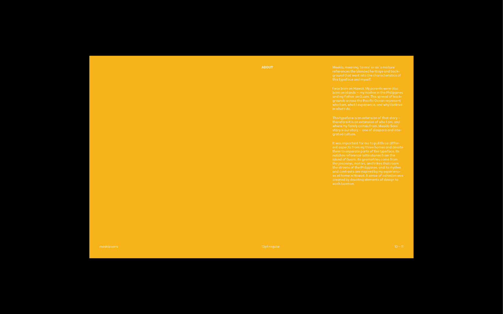
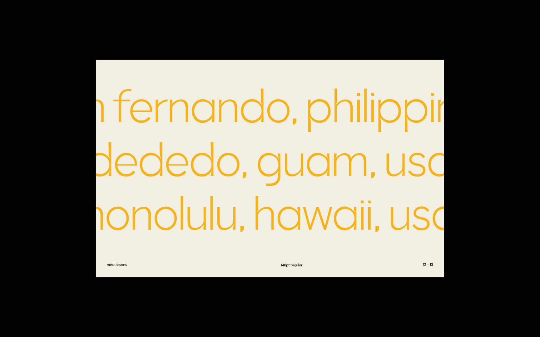
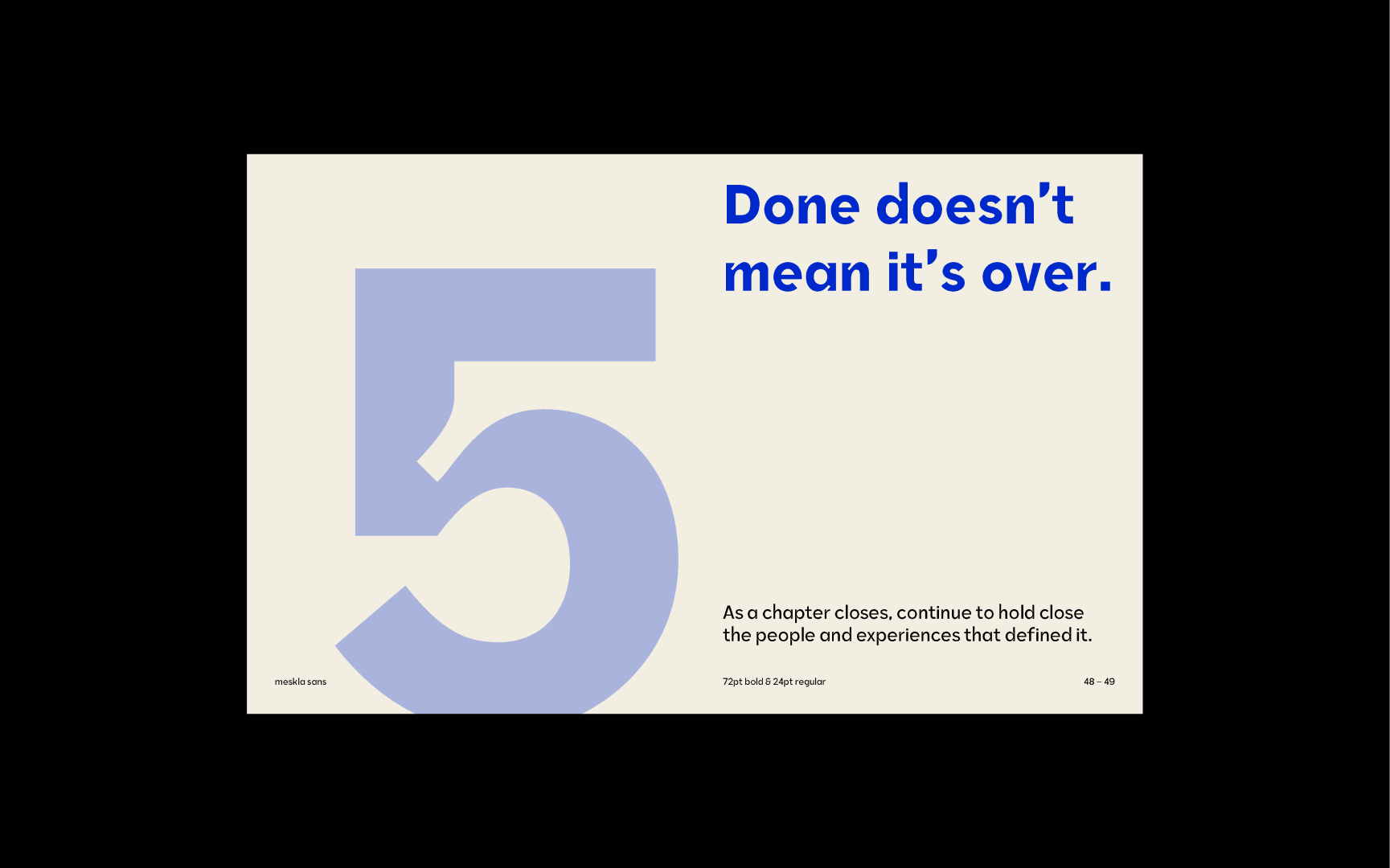
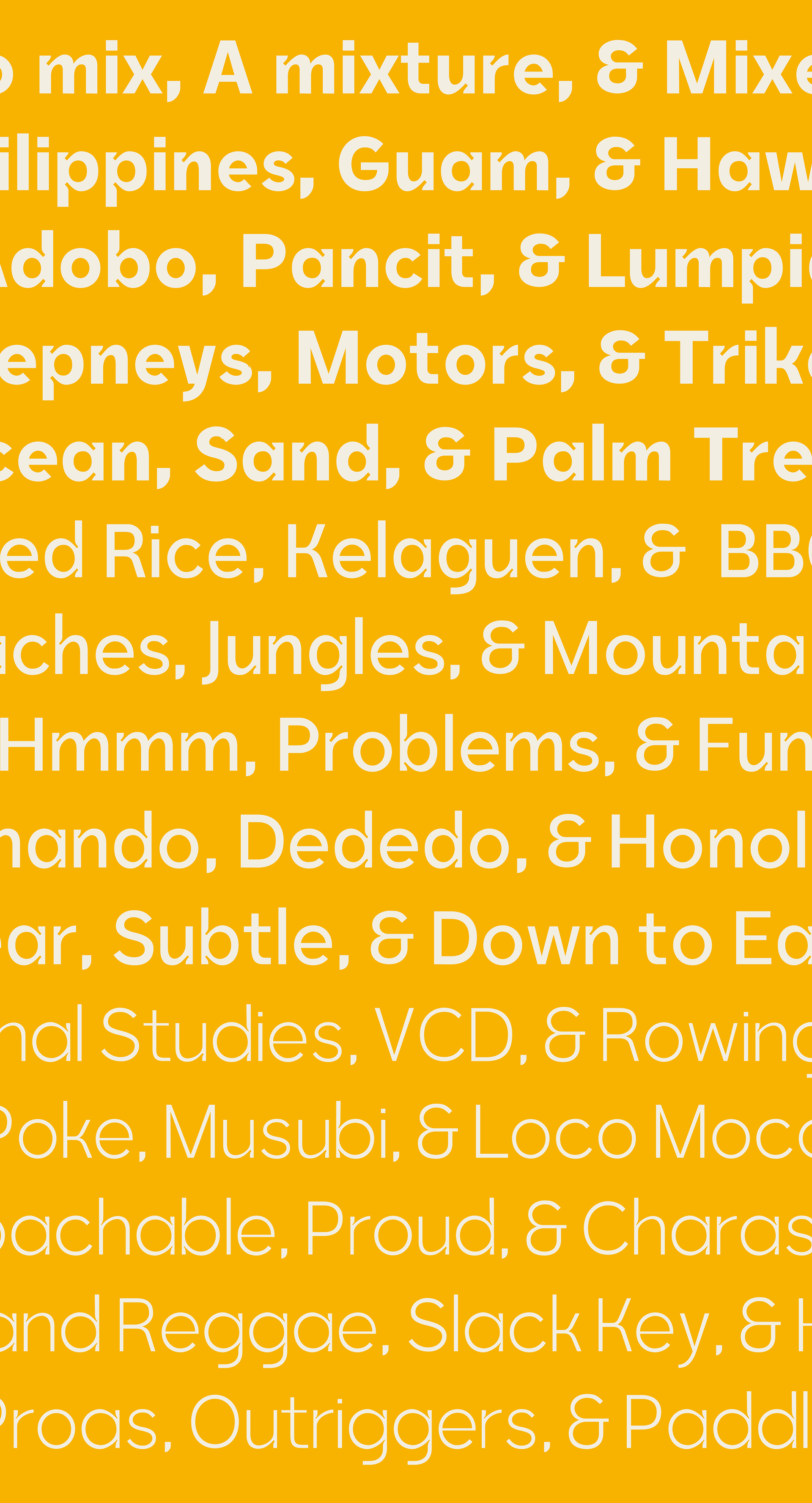
Meskla, meaning ‘to mix’ or as ‘a mixture’ references the blended heritage and background that went into the characteristics of this typeface and myself. I was born on Hawaii. My parents were also born on islands — my mother in the Philippines and my father on Guam. This spread of backgrounds across the Pacific Ocean represent who I am, what I experience, and why I believe in what I do. This typeface is an extension of that story — therefore it is an extension of who I am, and where my family comes from. Meskla Sans’ story is our story — one of diaspora and integrated culture.
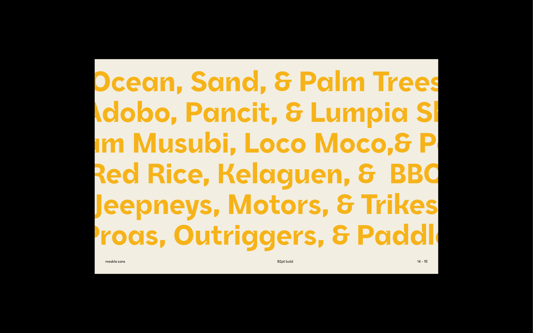
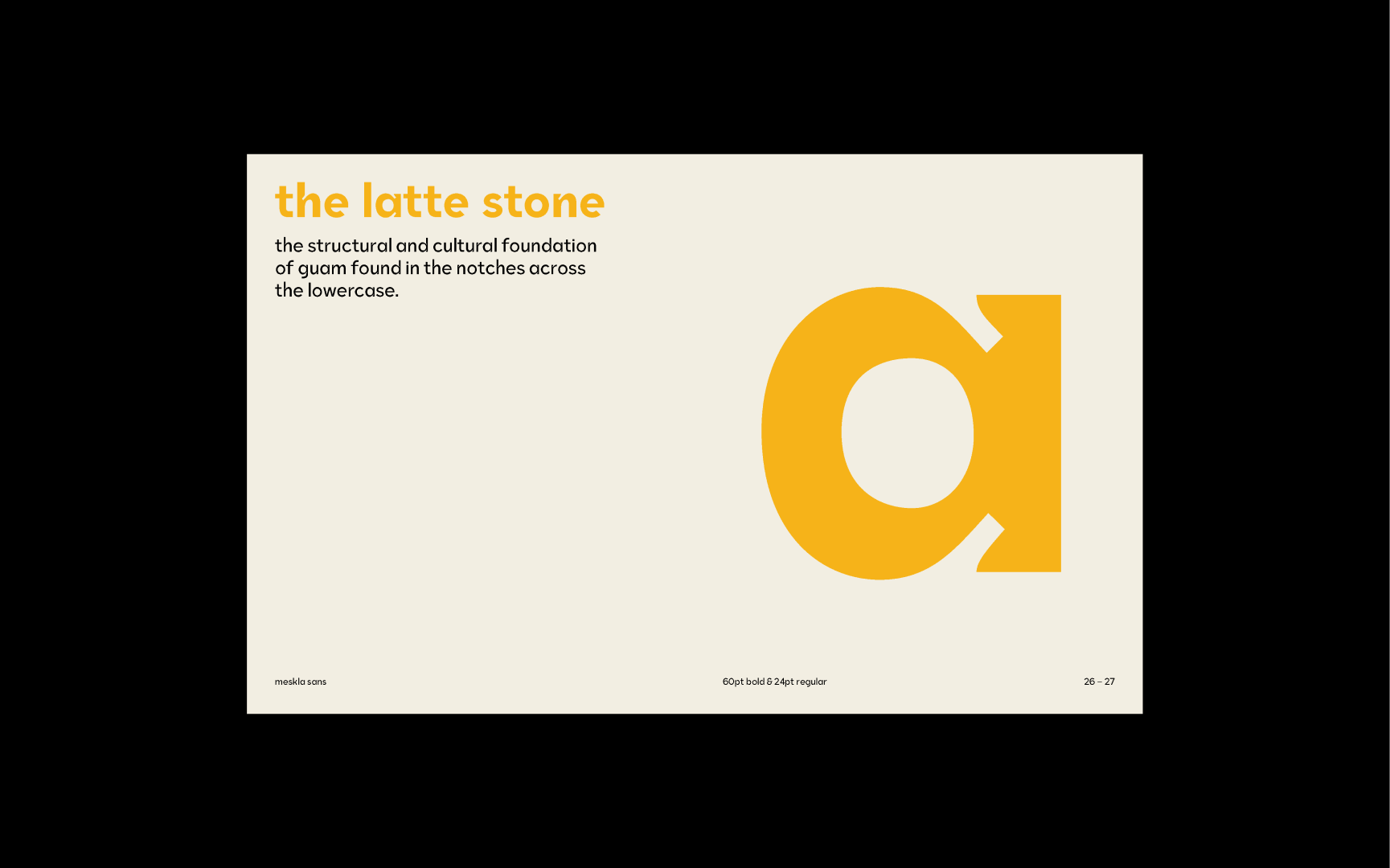
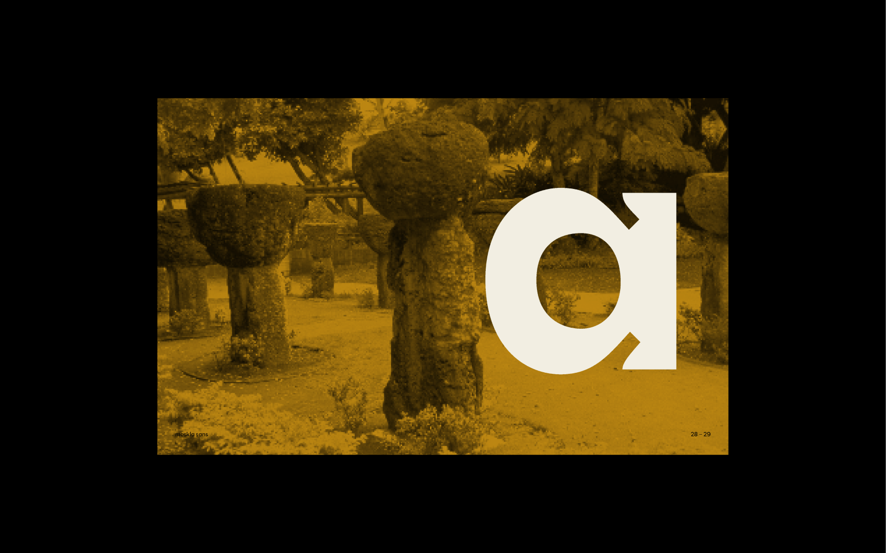
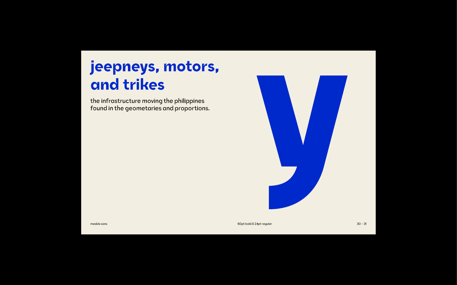
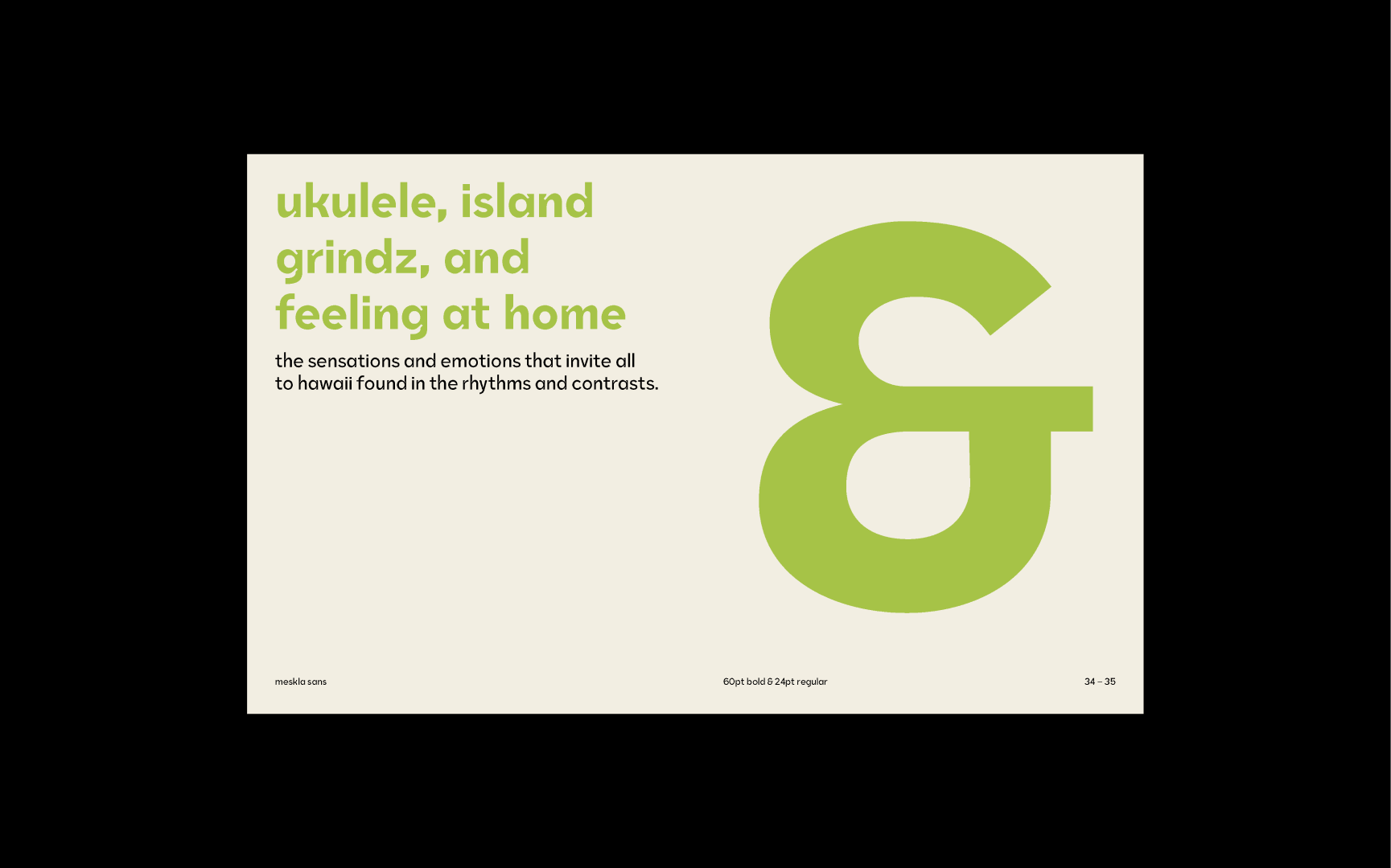
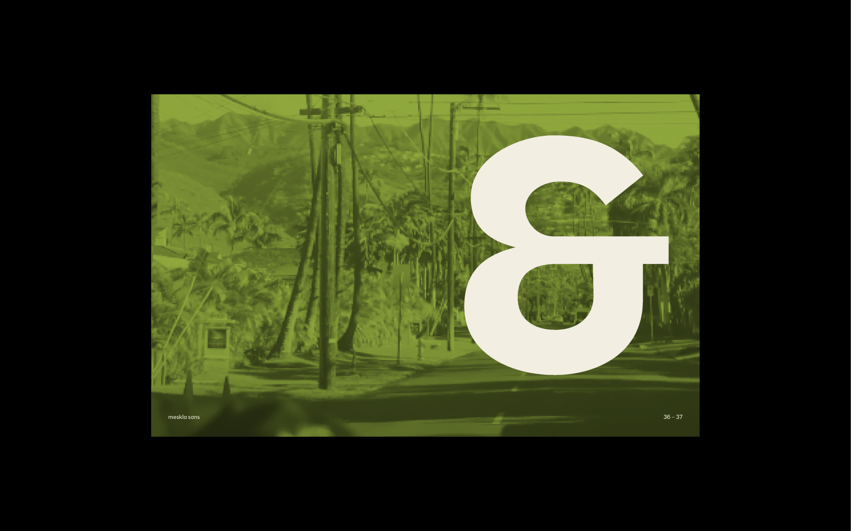
It was important for me to pull three different aspects from my three homes and devote them to separate parts of the typeface. Its notches reference latte stones from the island of Guam, its geometries come from the jeepneys, motors, and trikes that roam the streets of the Philippines, and its rhythm and contrasts are inspired by my experiences at home in Hawaii. A sense of cohesion was created by devoting elements of design to each location.
This was one of my capstones designed during my final term in the Visual Communication Design program at the University of Washington. The type specimens were selected to be displayed at our capstone exhibition.

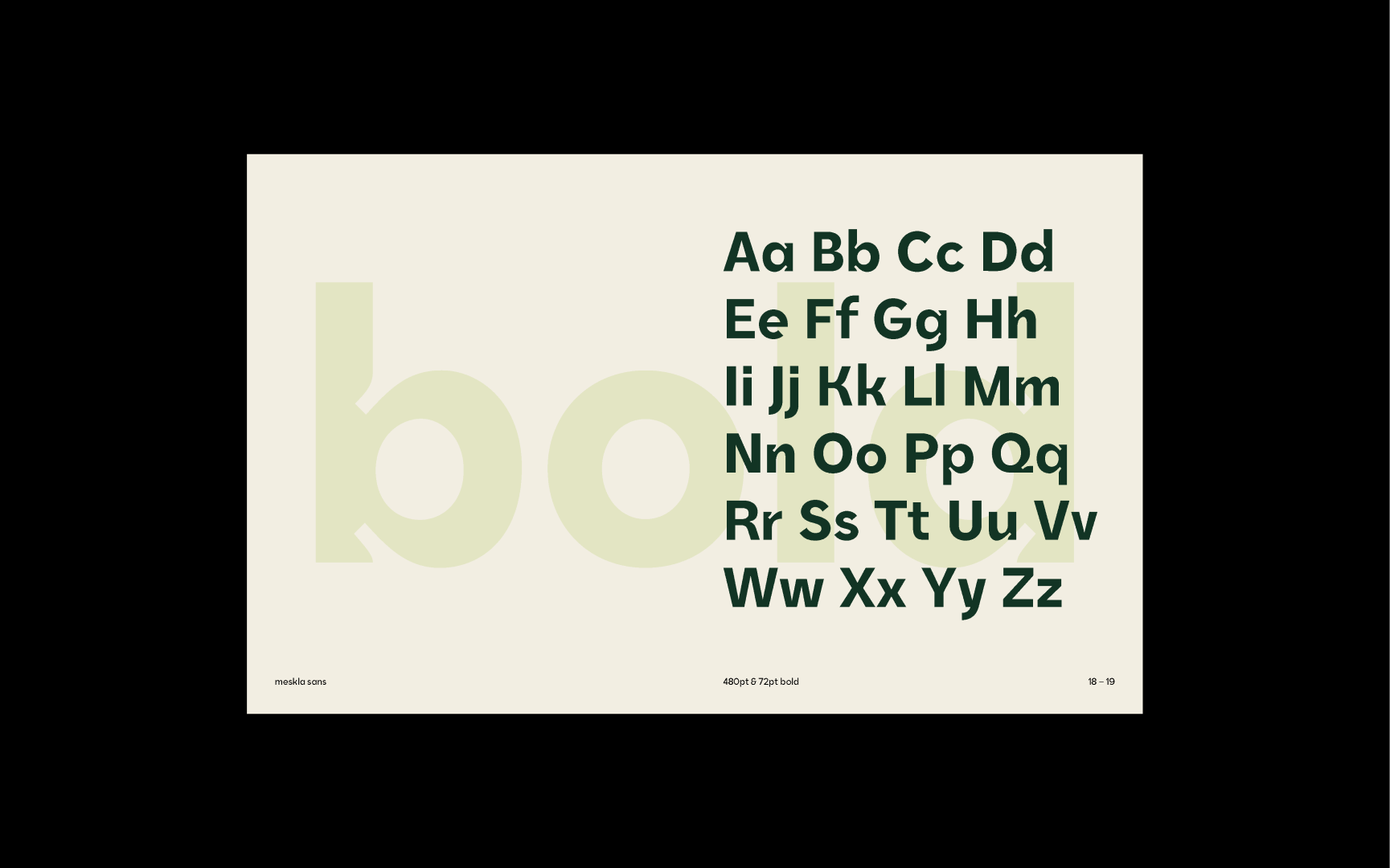


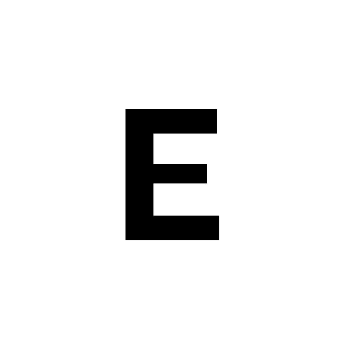
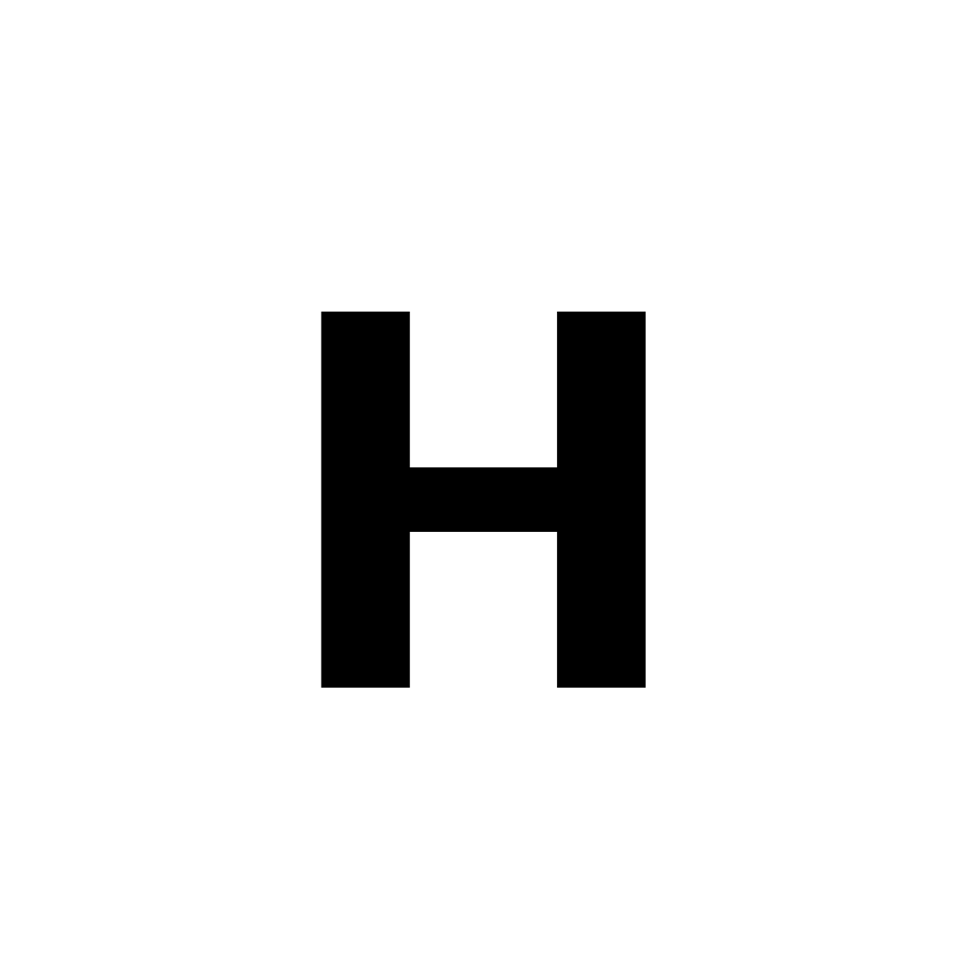
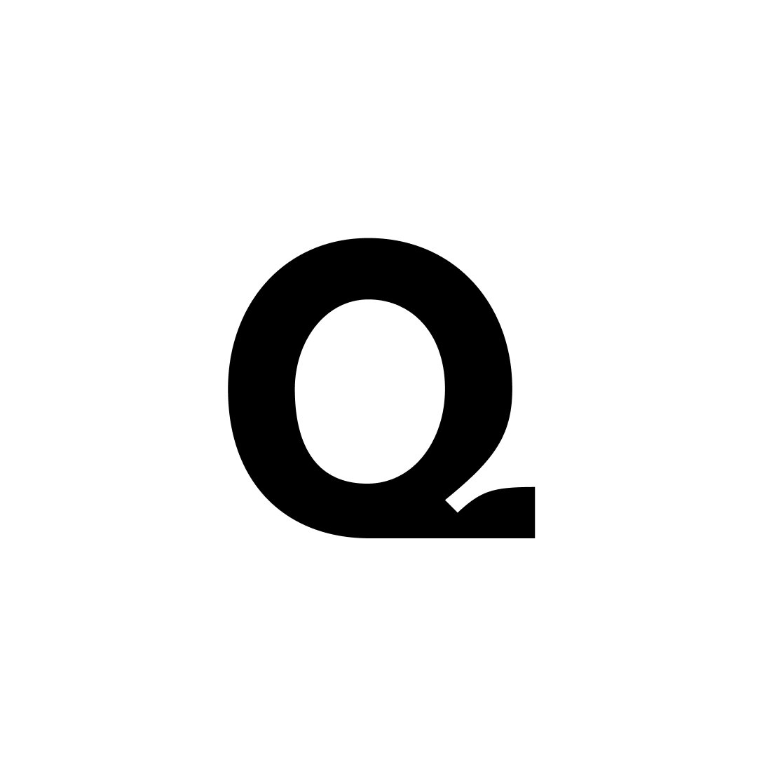
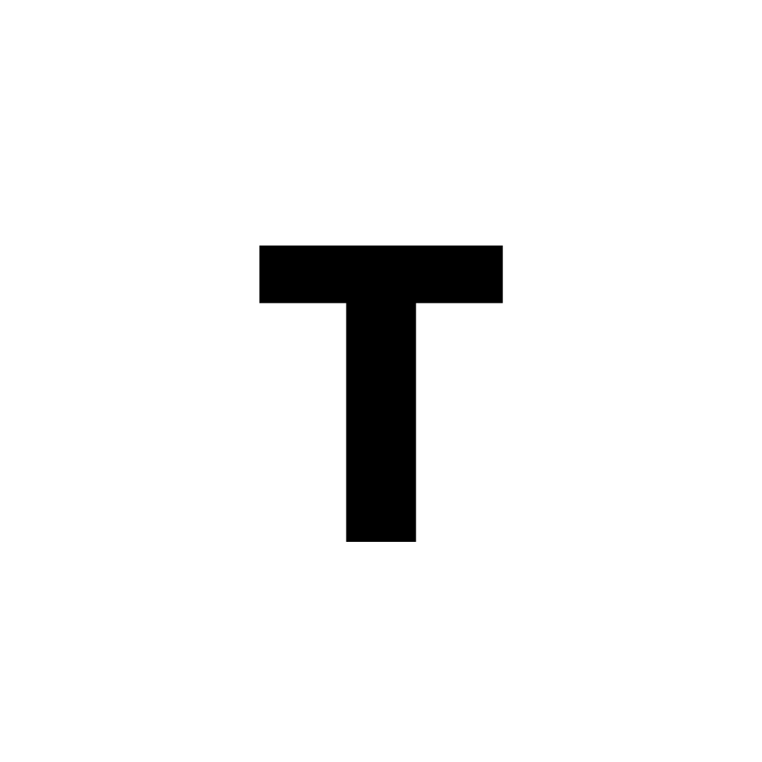
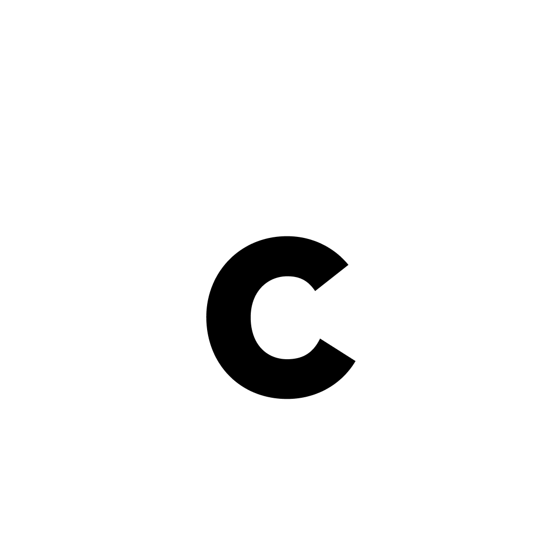
Uppercase


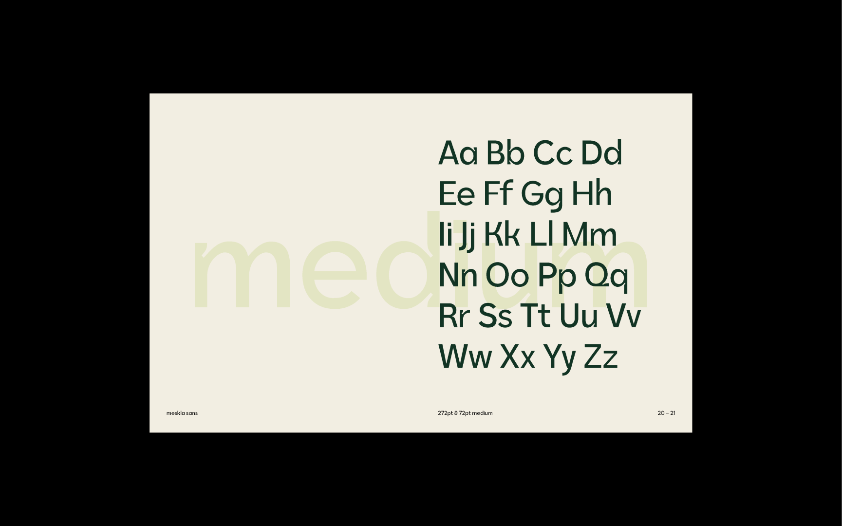
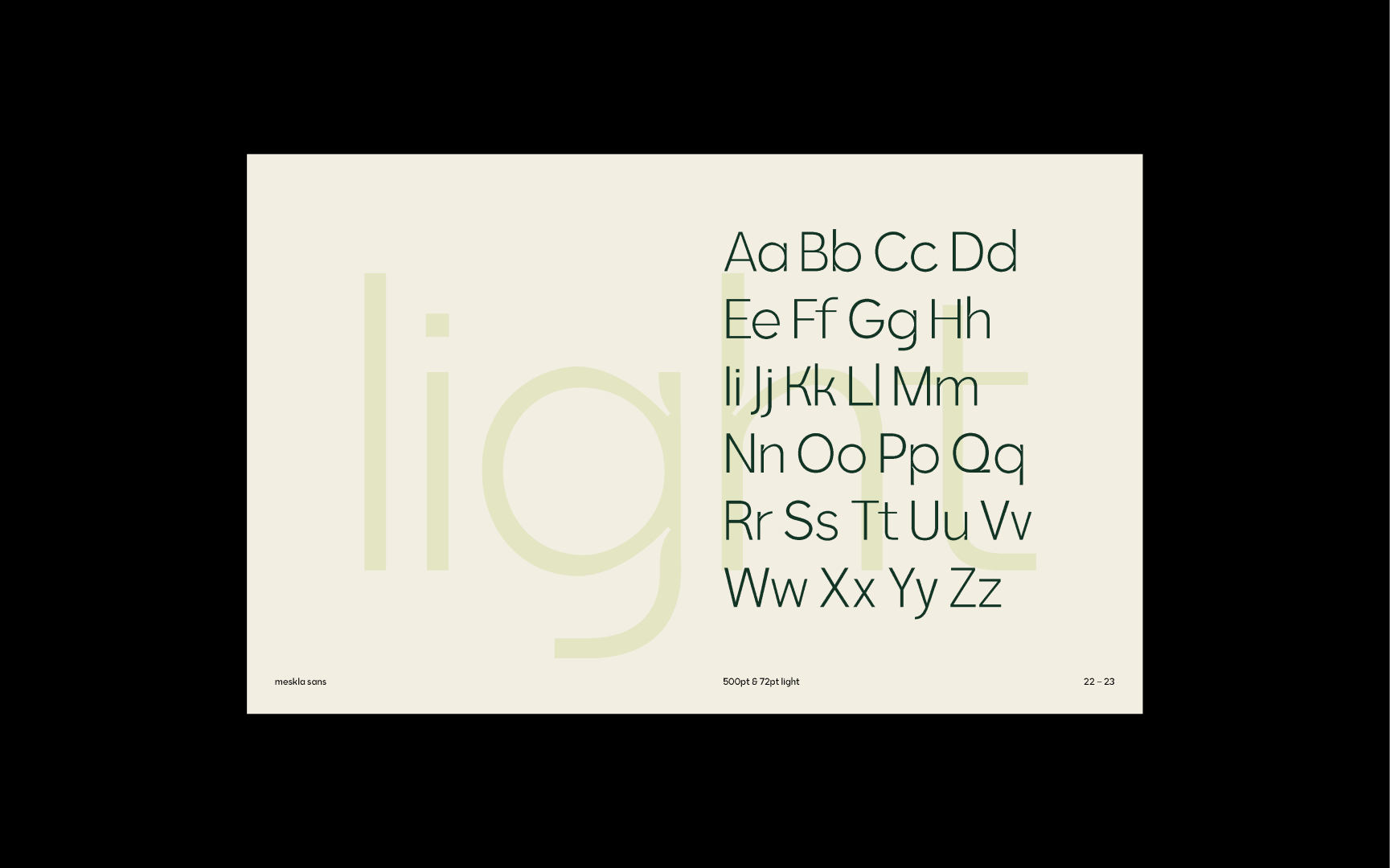
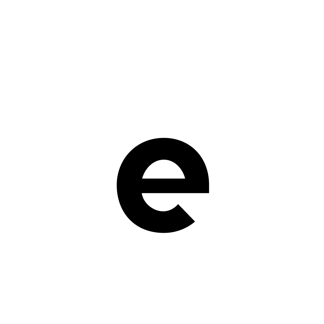
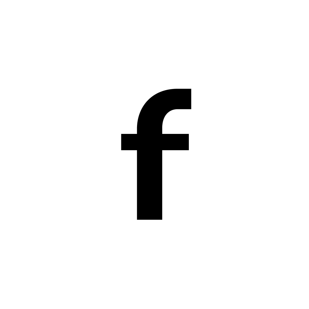
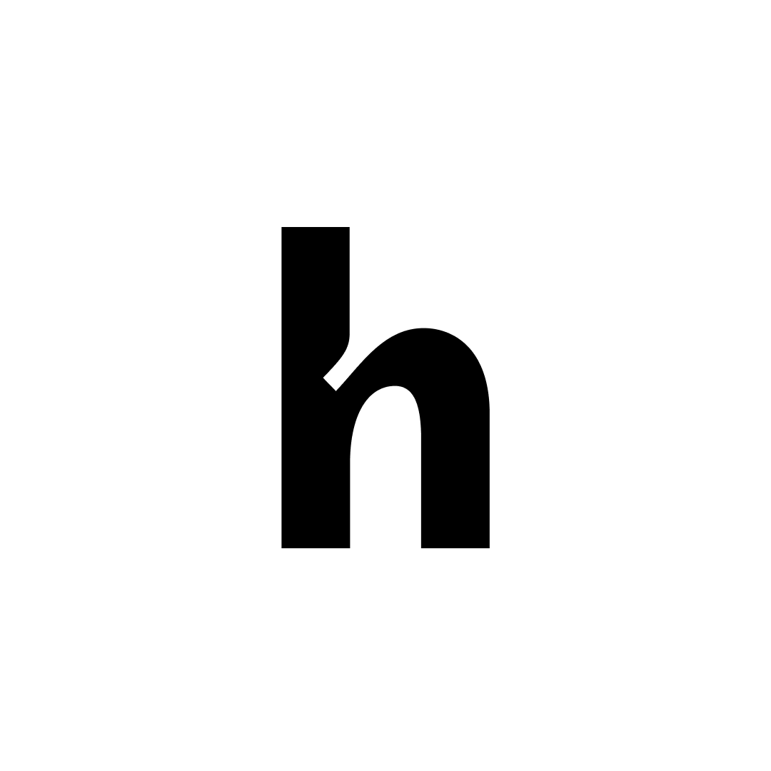
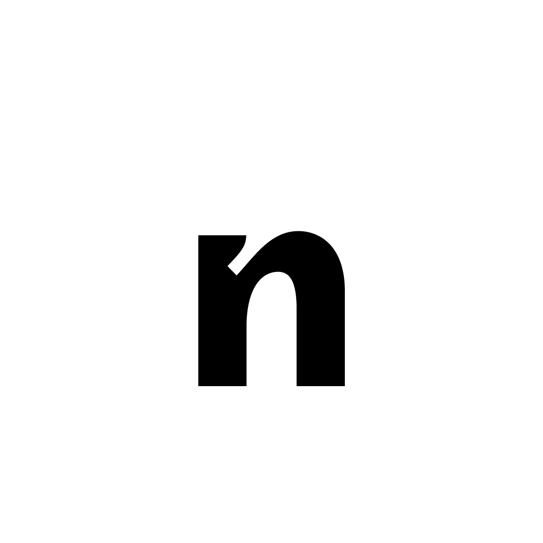
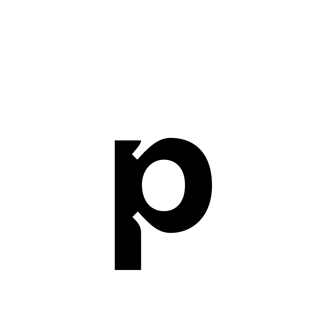
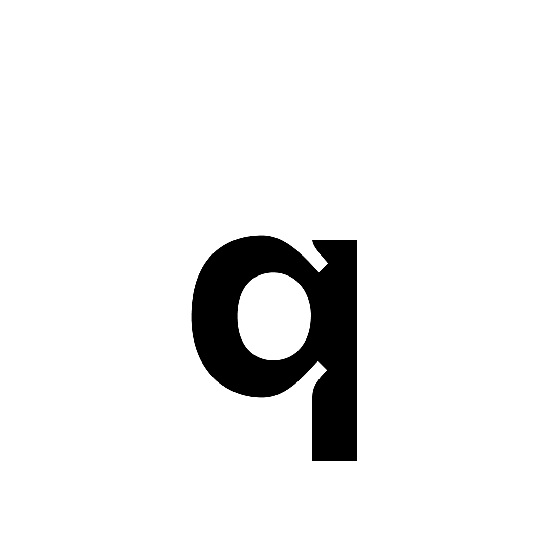
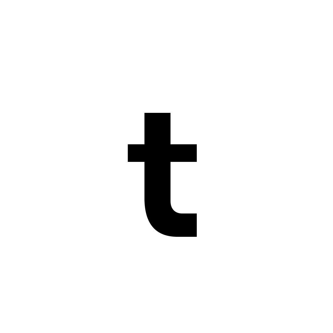
Lowercase


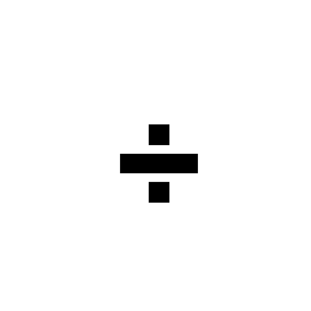
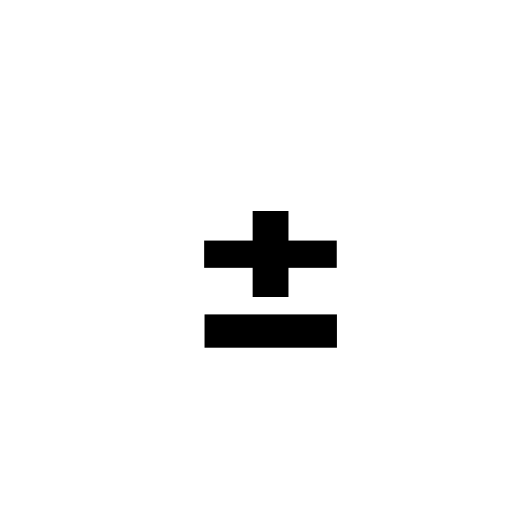
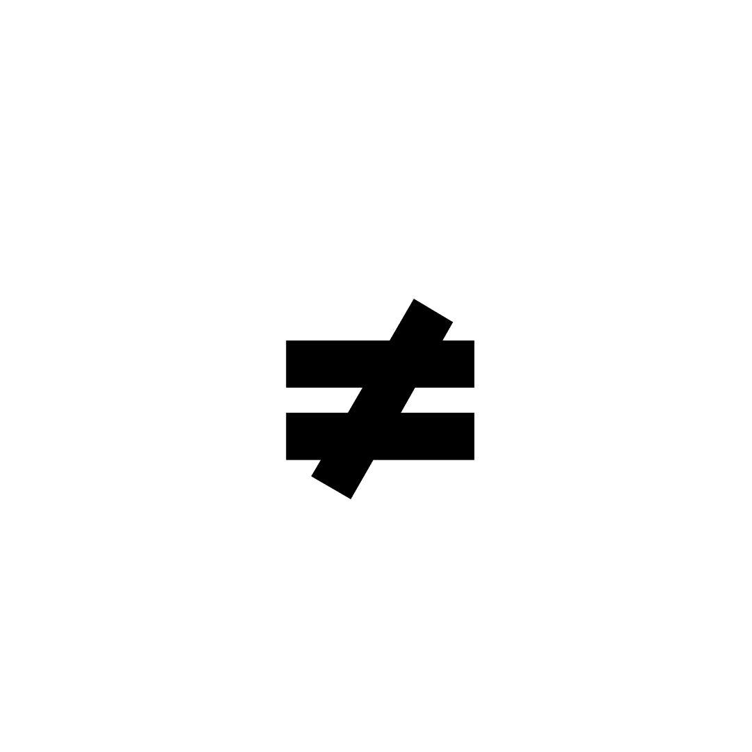
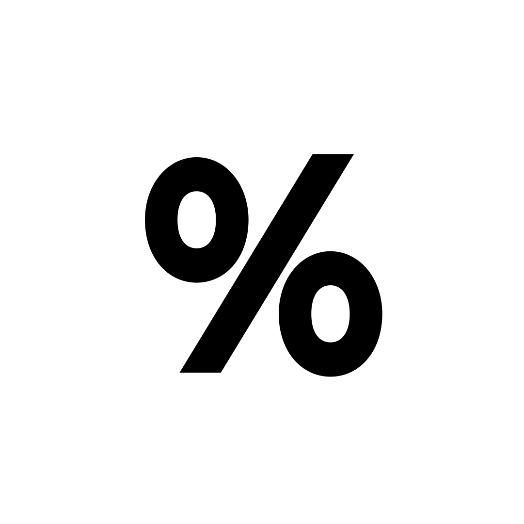
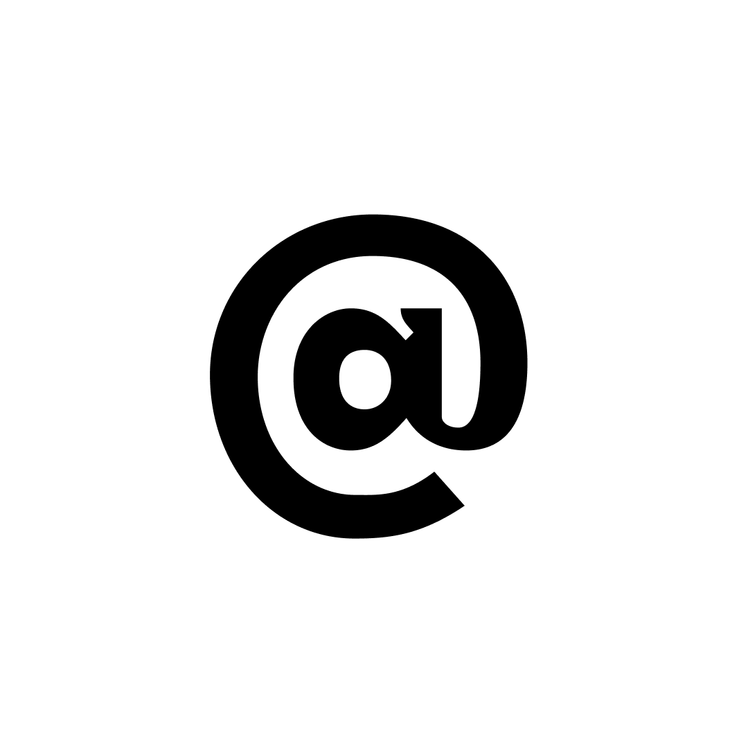
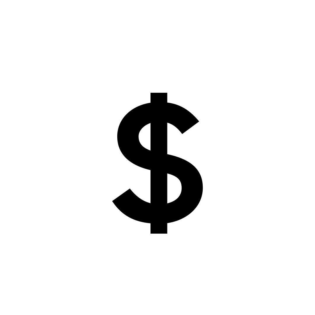
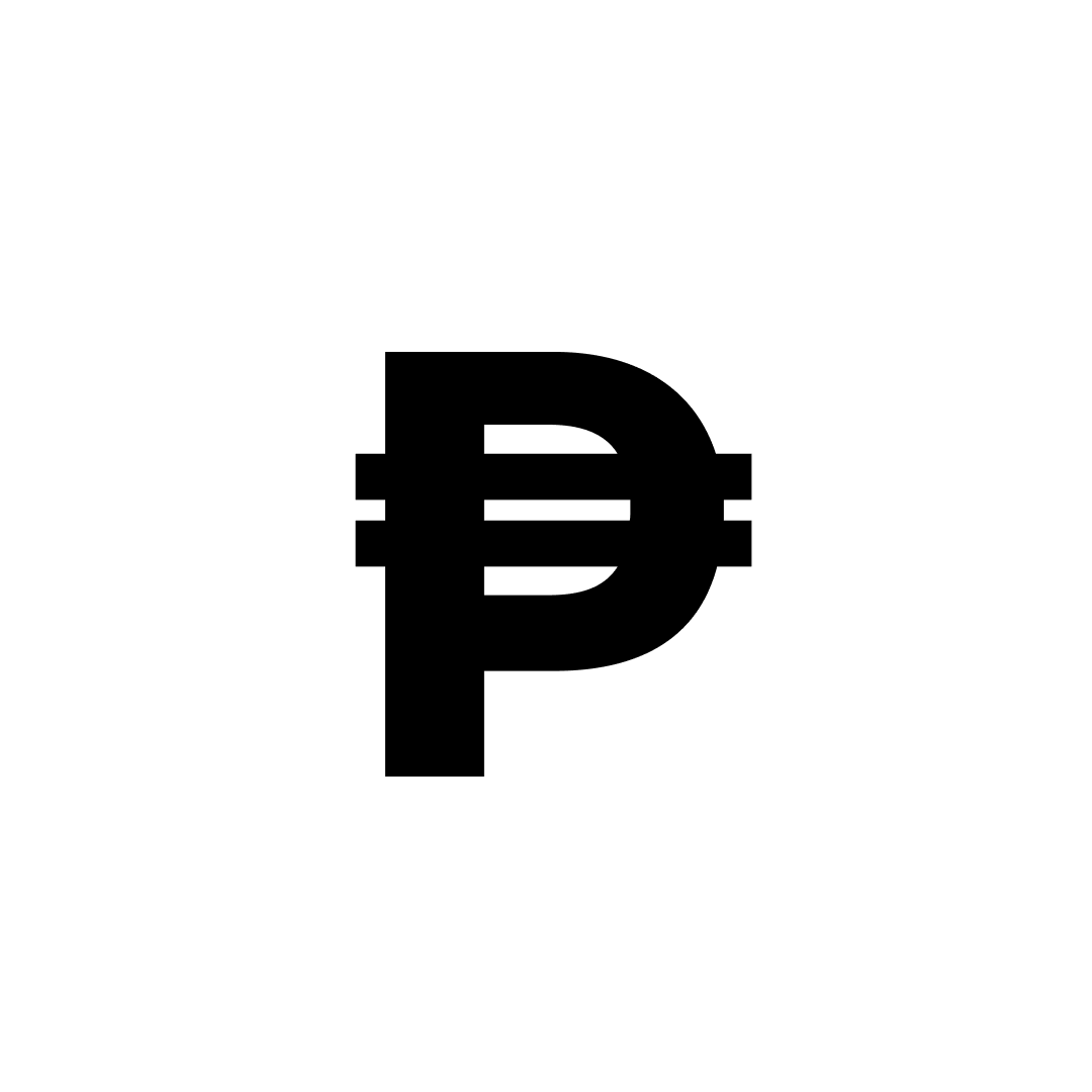
numbers + math


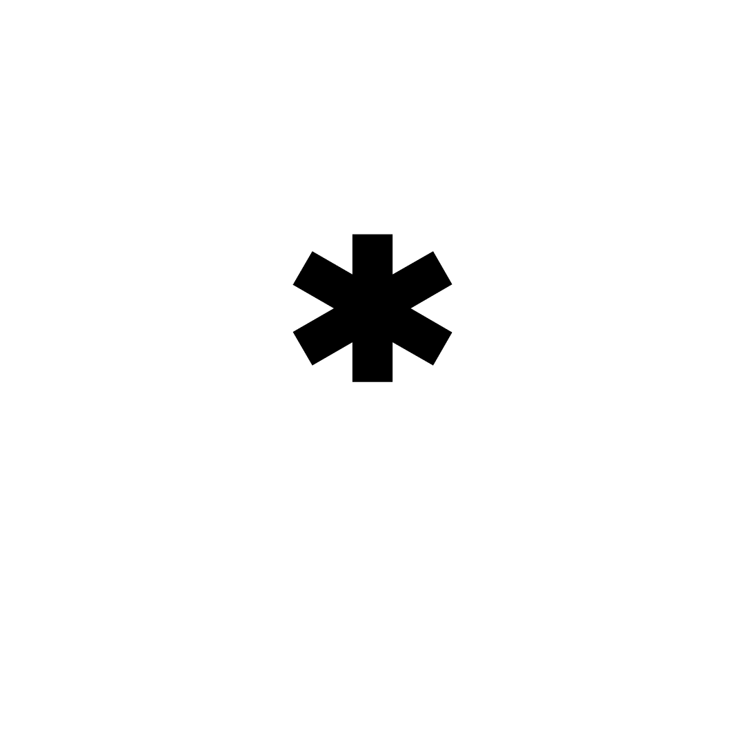
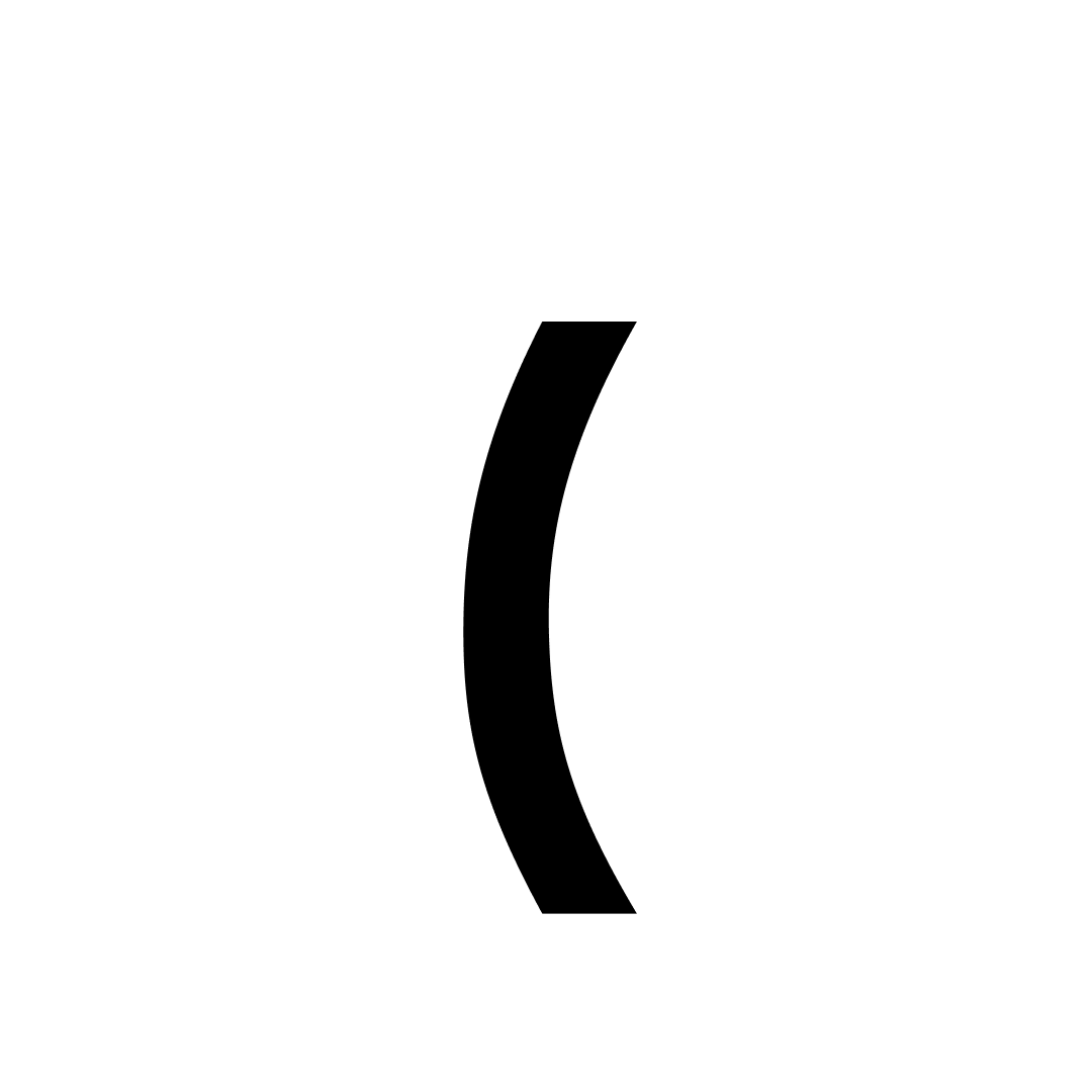
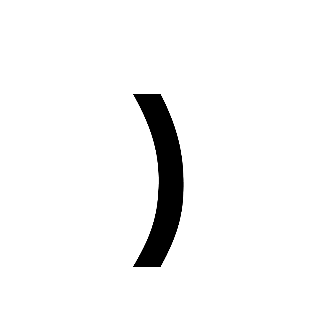
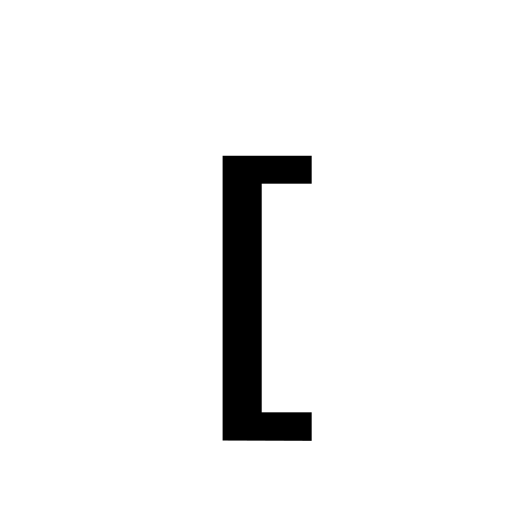
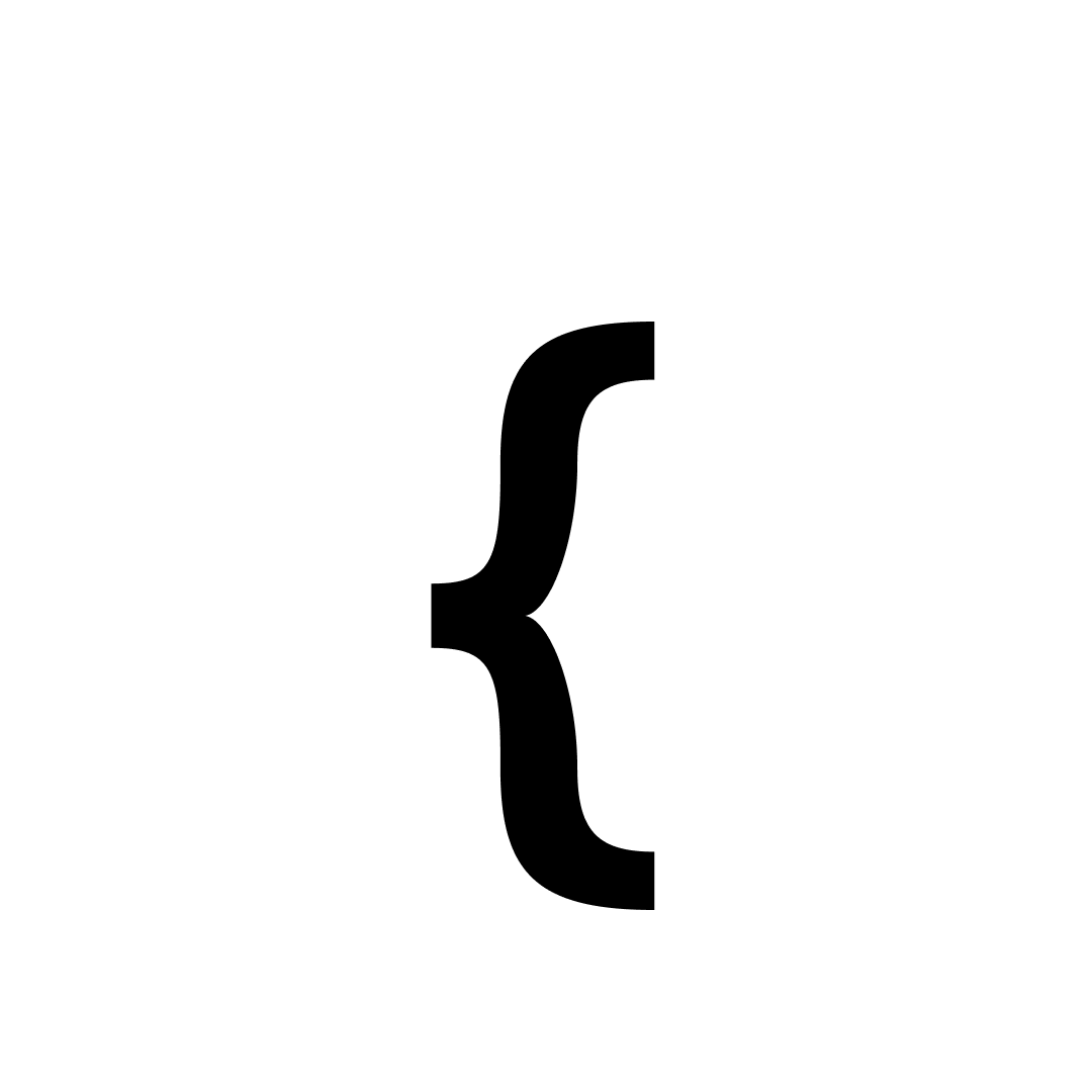
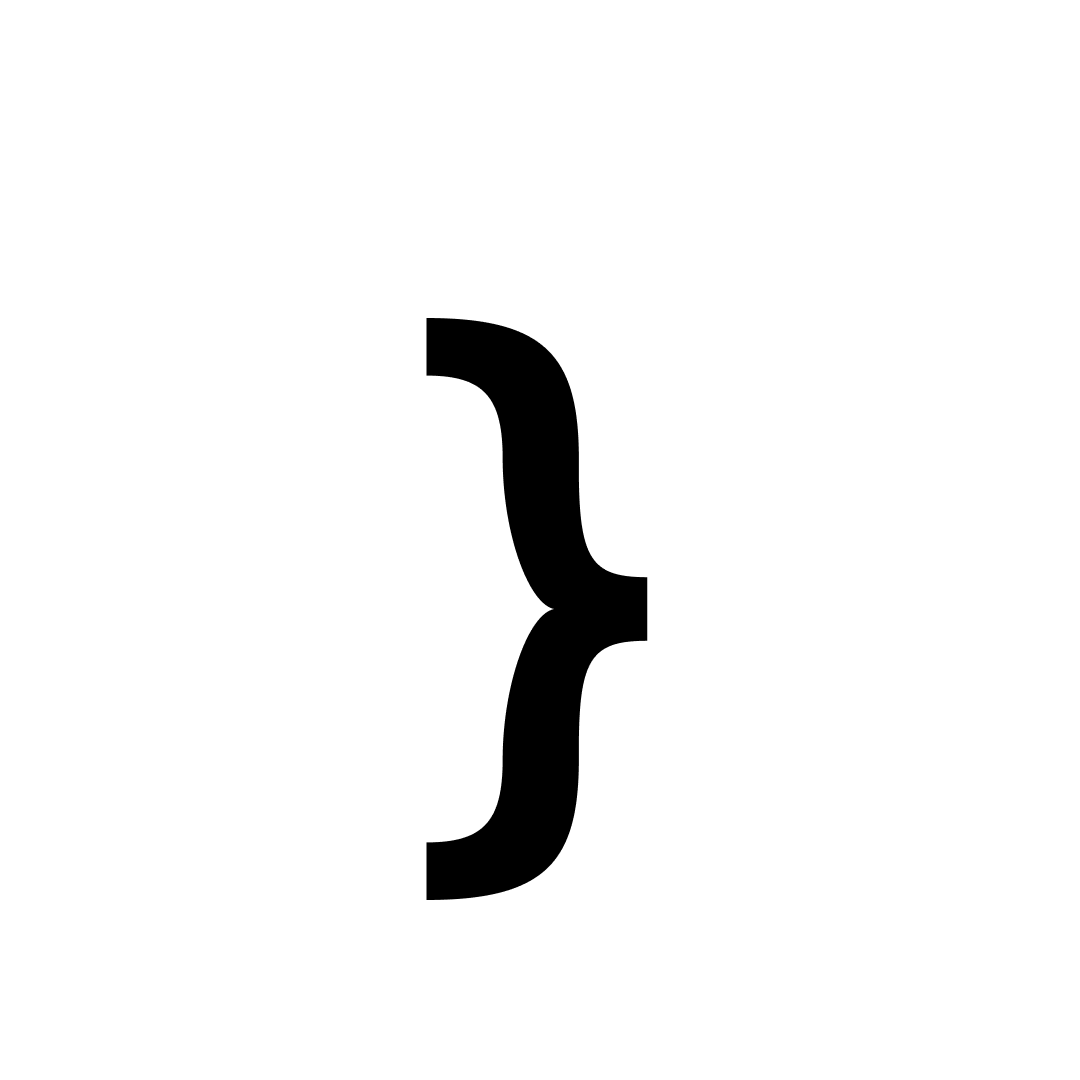
Punctuation


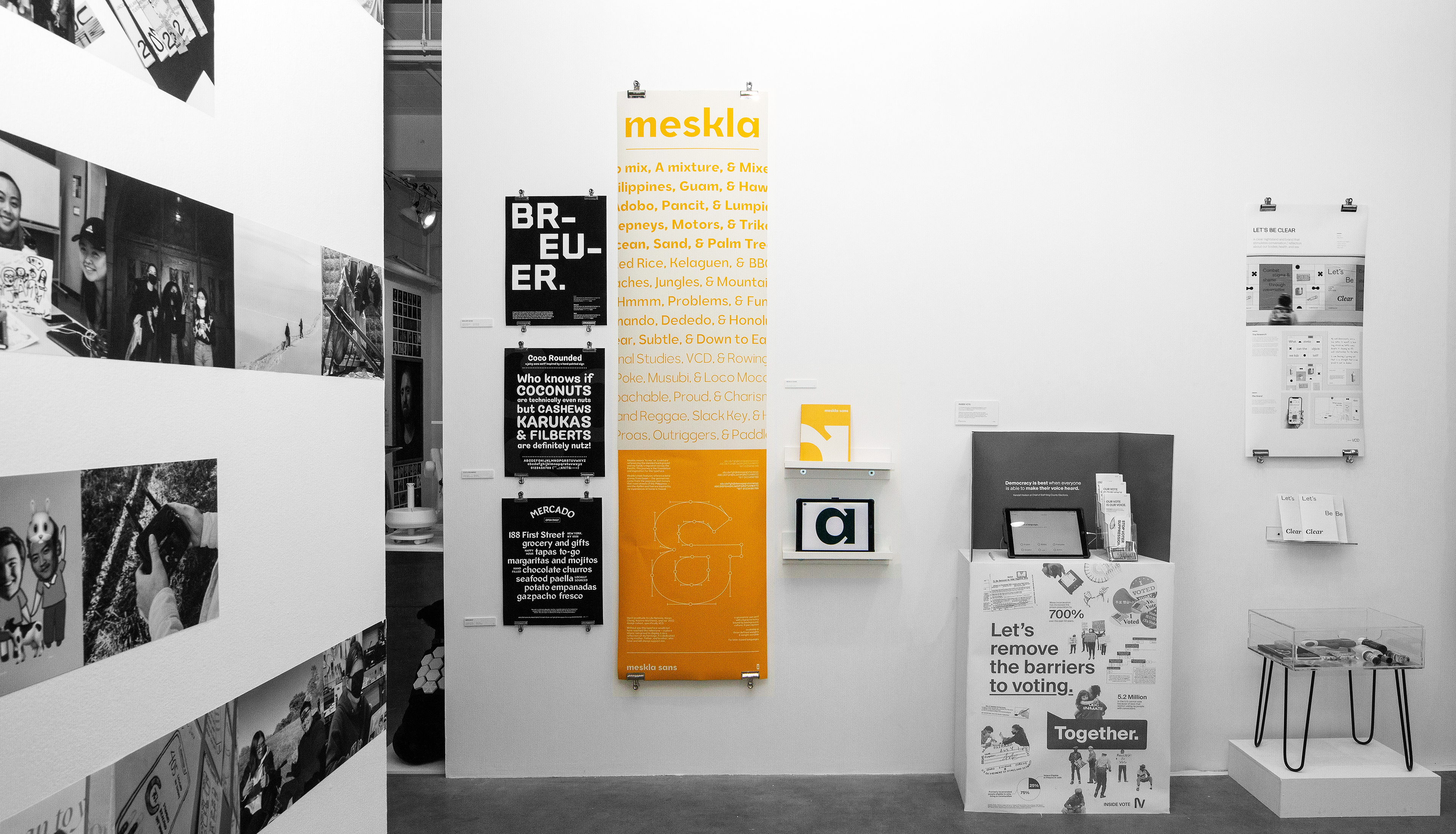
ABOUT Meskla Sans
context
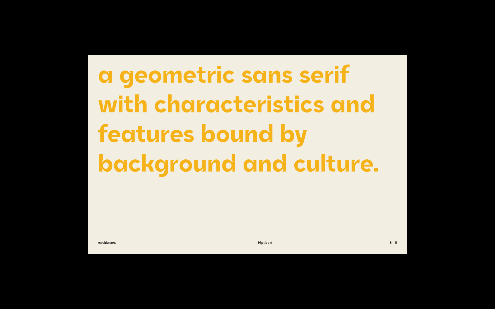
a variable weight typeface
spring 2022 — 11 weeks
spring 2022 — 11 weeks
Guidance
Lila Symons — Alphabettes Mentor
Kristine Matthews — VCD Professor + Chair
Karen Cheng — VCD Professor
Kristine Matthews — VCD Professor + Chair
Karen Cheng — VCD Professor
DESIGN GOAL
explore my own heritage and background through the creation of a typeface.
ACCOLADES
ADC Silver Cube in Typography (via Typefaces / Font Systems)
TDC Certificate of Excellence in Type Design / Type Family
Published in TDC Best of Type & Typography Annual
Displayed in TDC Global Exhibitions
Displayed in UW Design Show
TDC Certificate of Excellence in Type Design / Type Family
Published in TDC Best of Type & Typography Annual
Displayed in TDC Global Exhibitions
Displayed in UW Design Show
.