have a gander!
Present & Correct London, stylized as 'Present /&/ Correct' is a showcase for the things people have enjoyed since school. P&C's long-term obsession with stationery culminated in their constantly evolving store. Present & Correct aims to spark distance memories and make you smile or look at the most mundane in a new and fonder light.
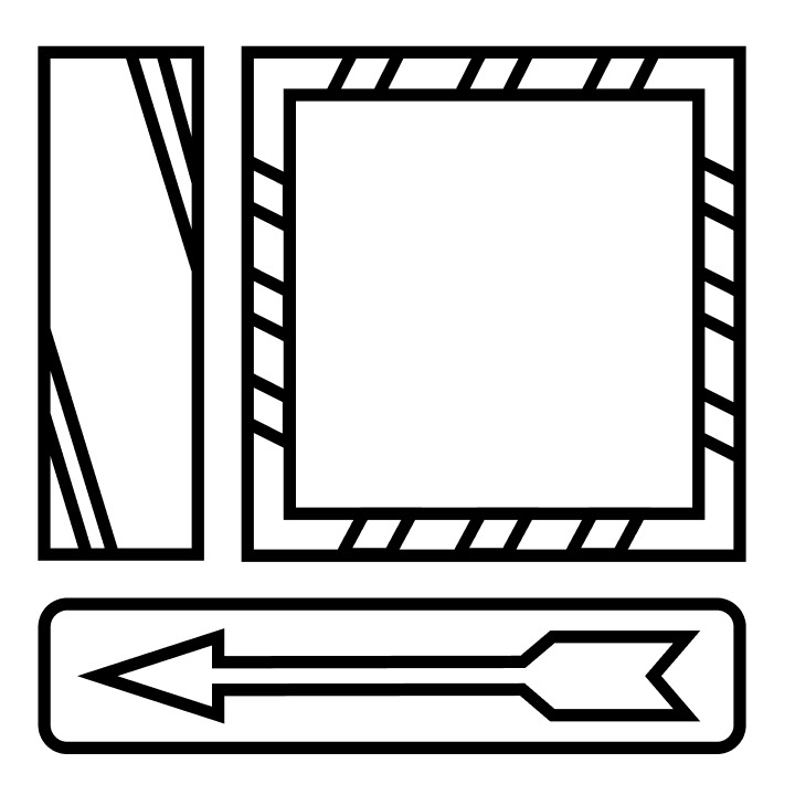
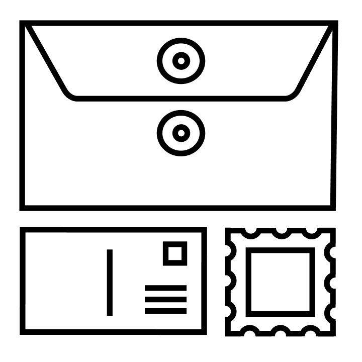
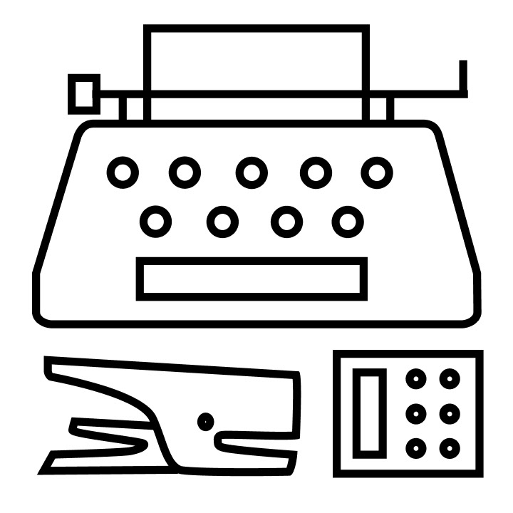
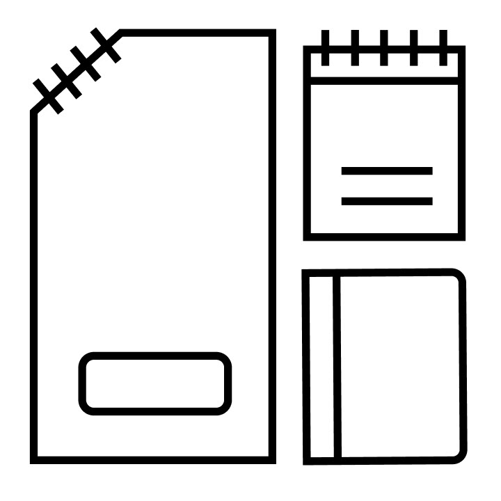
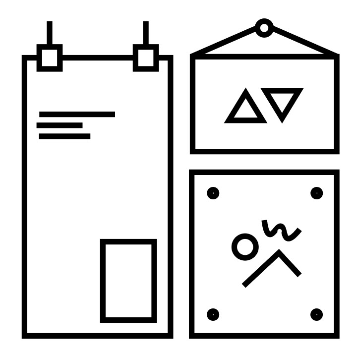
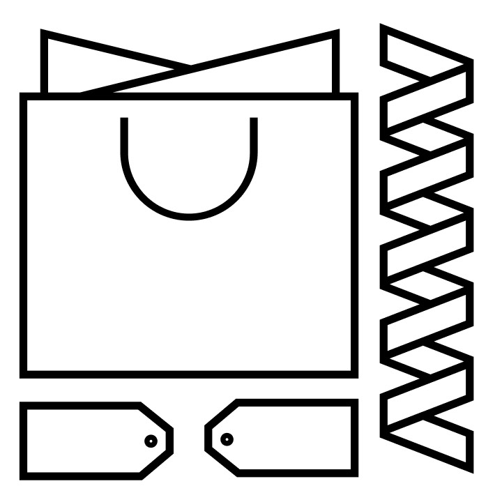
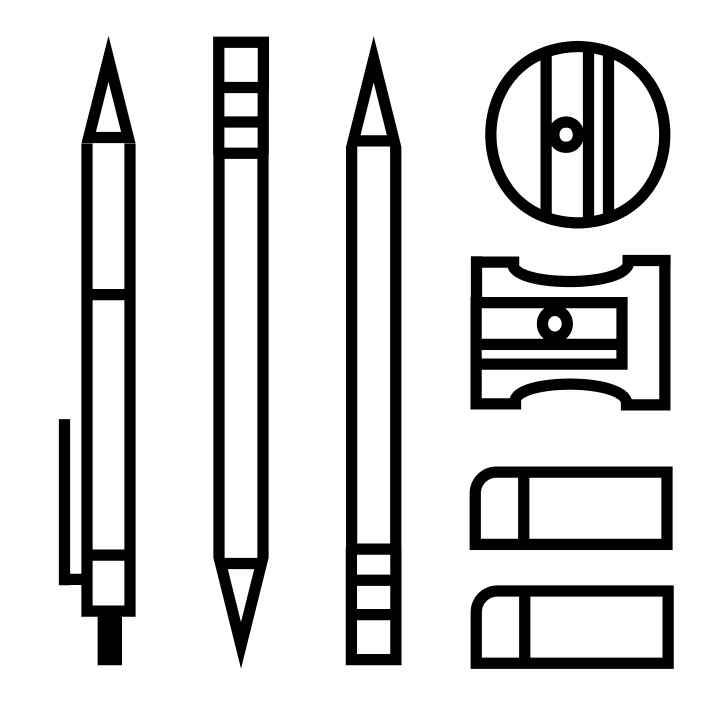
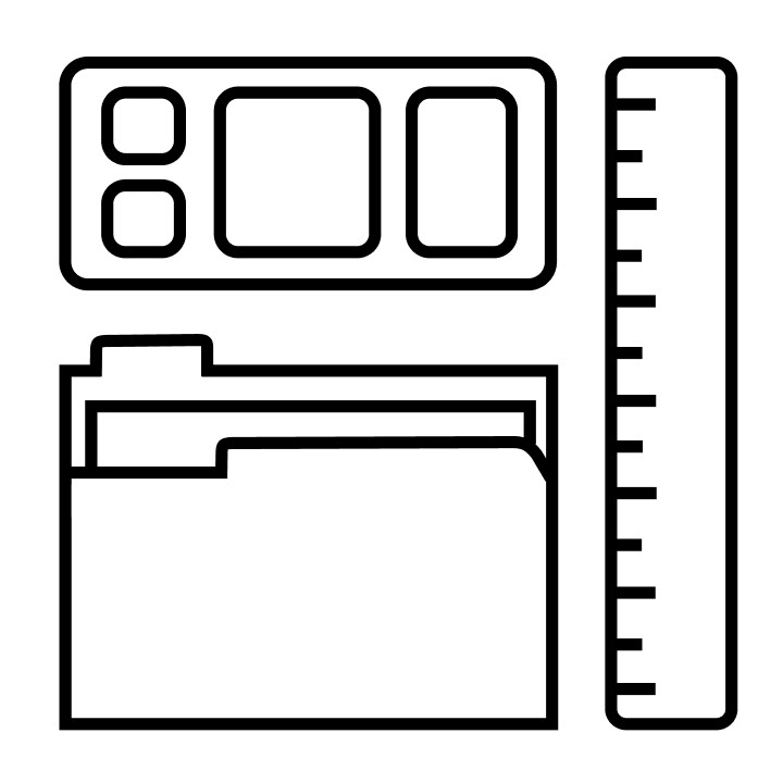
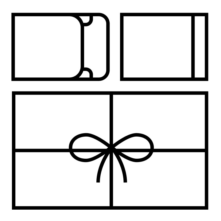
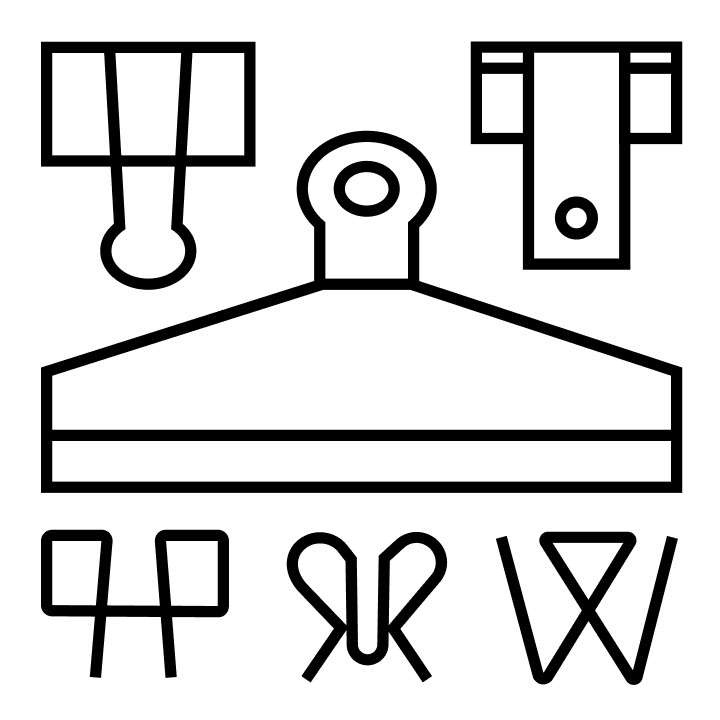
As a team, we explored ways to extend Present & Correct’s minimalist type and pattern-based brand through a new set of icons. We were inspired by their tidy store layout and their flat-lay product photography. These icons aim to convey their minimalist, charming, and unique essence. They are intended for functional and decorative use throughout the store.
The Bits + Bobs
CONTEXT
a symbol set
spring 2020 — 5 weeks
spring 2020 — 5 weeks
CLIENT
Present /&/ Correct London
Karen Cheng — DES214: Marks & Symbols
Karen Cheng — DES214: Marks & Symbols
Partner
Ashley Wang — Visual Communication Design
TOOLS
pen & paper, Illustrator, Photoshop, Figma


cheers
Kudos to Ashley Wang for putting up with all my microscopic adjustments and for constantly keeping me on top of our deadlines. Thanks to our TA’s Philbert Widjaja and Ruby Peven for always providing new crit. Finally, thank you Karen, who made the transition online feel as genuine and comparable to a real in-class experience, whose depth of knowledge was indispensable for success, and whose thoughts and critique extended beyond the scheduled zoom calls.