Pre-Flight Briefing
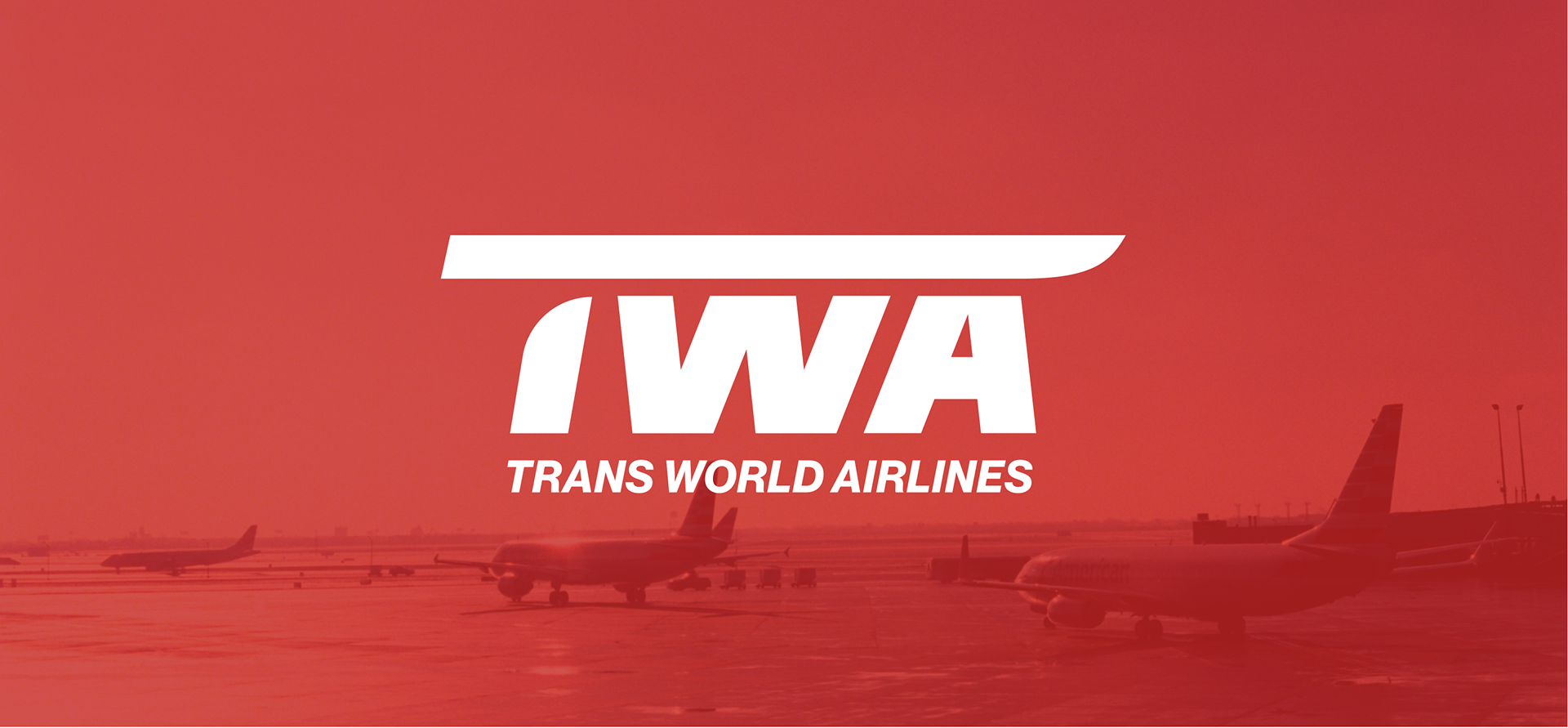
Trans World Airlines (TWA) is an American based international airline. At the beginning of the 1930s, four small airmail companies merged to form TWA. Before long, the small air services grew eventually competing with the likes of PanAm for the best in-flight service and the most global destinations. The airline went defunct at the end of the 90s, selling its assets to several still existing carriers.
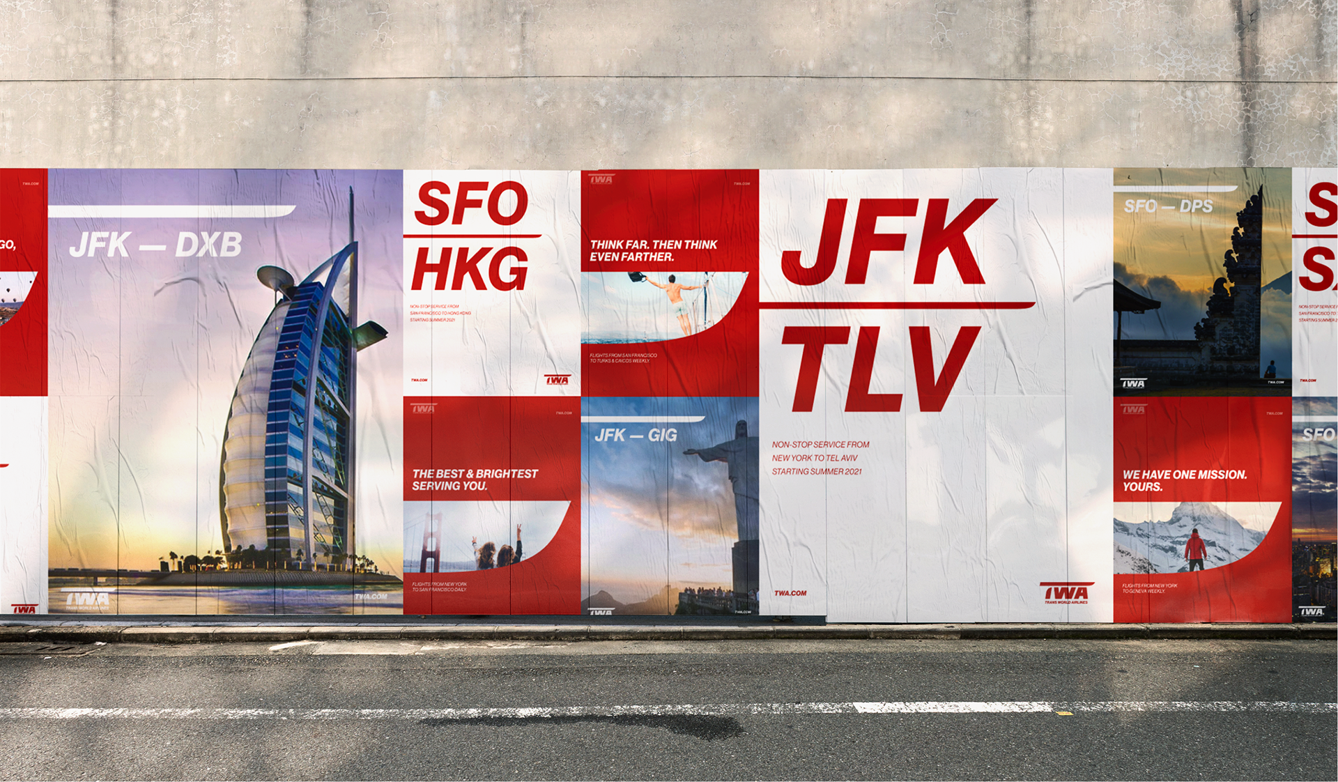
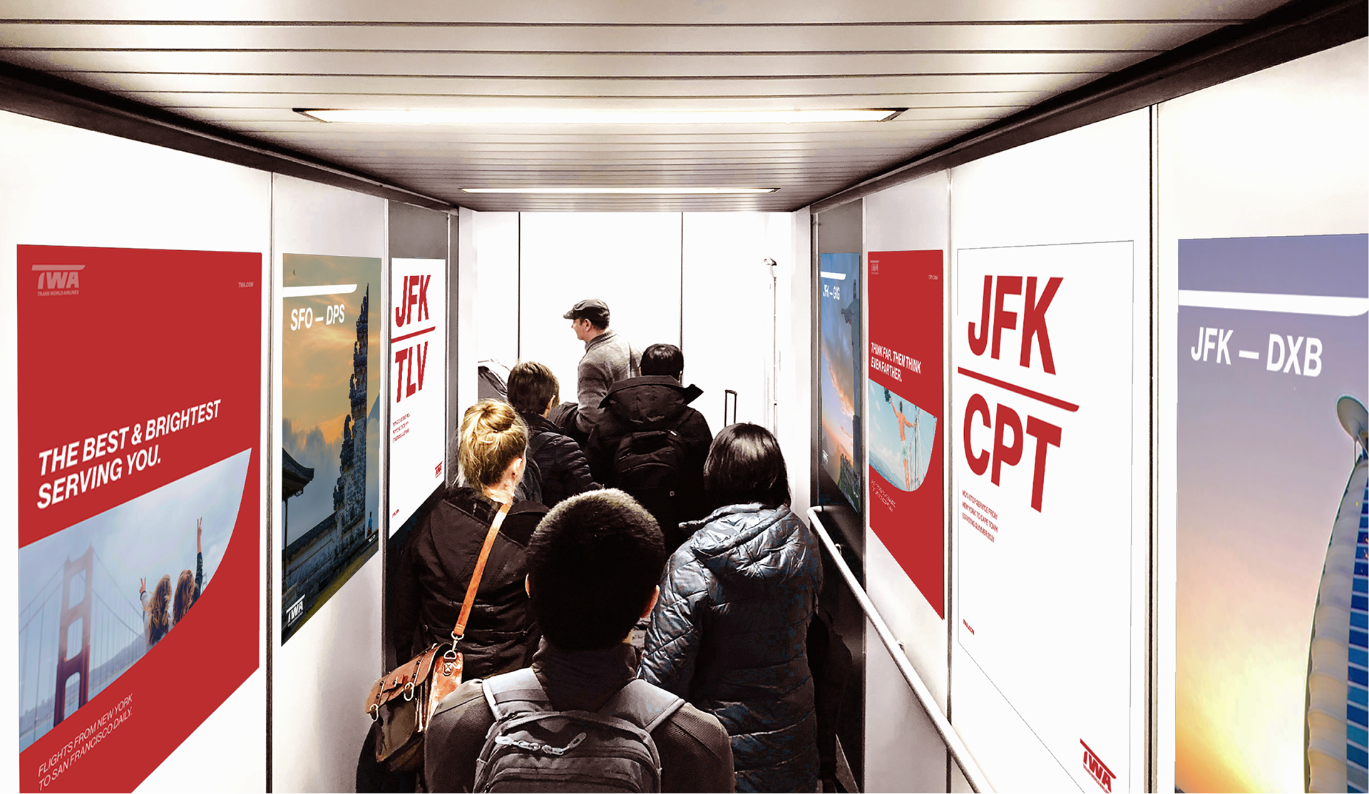
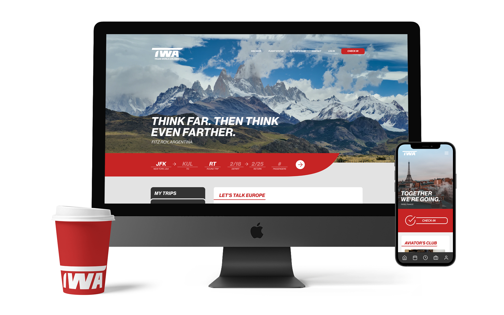
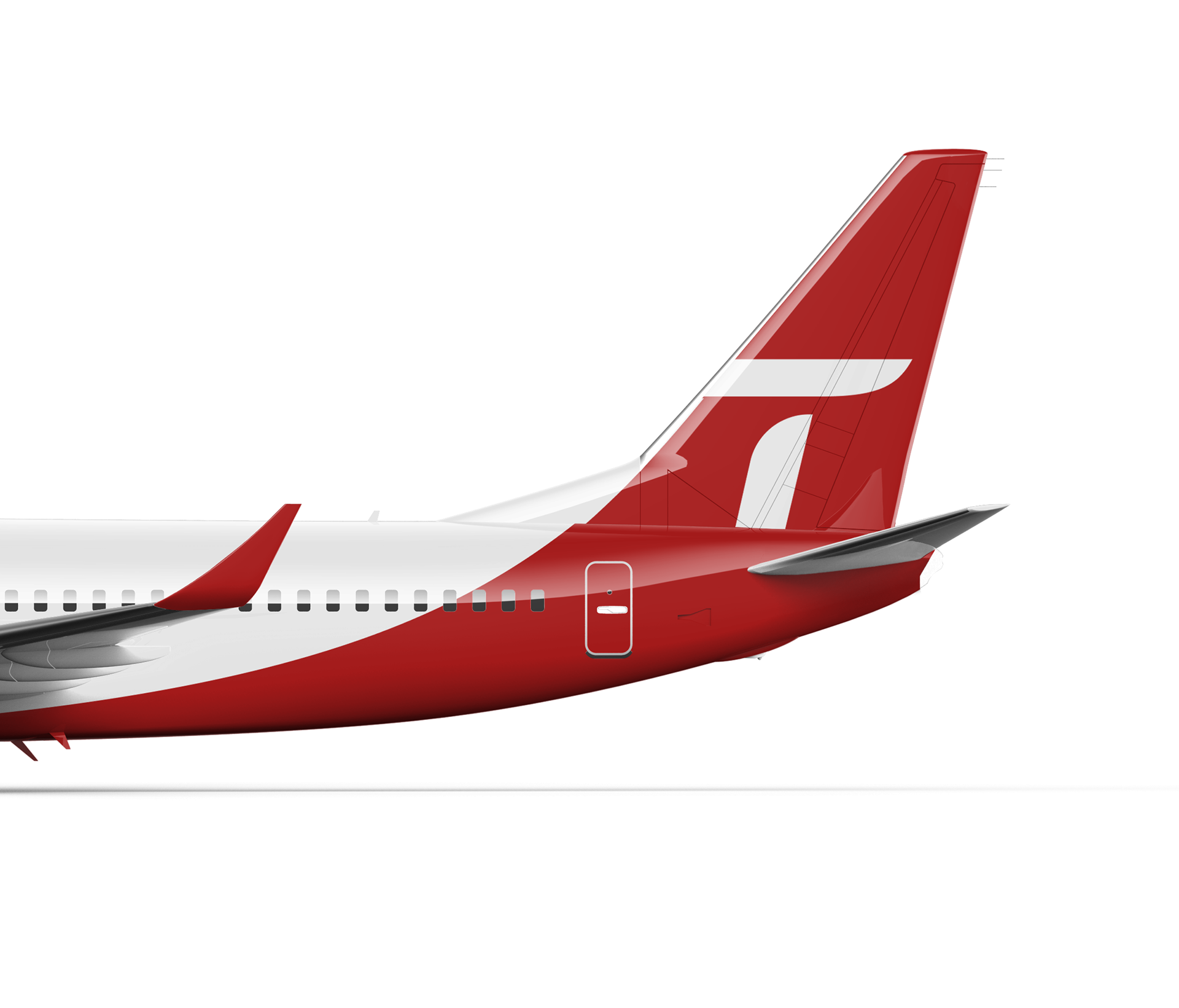
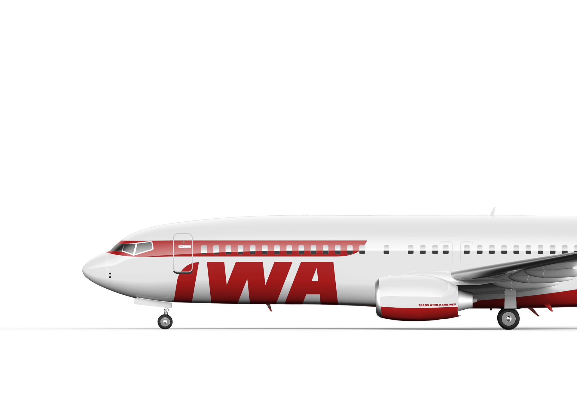
This project imagines what could be if TWA were to reemerge in the digital era to continue its mission of being the golden standard for air travel. TWA have one of the longest and richest histories in the aviation industry passenger movement. This rebrand seeks to continue this legacy for a new generation, as well as the old, to feel (or re-feel) the golden age of air travel.
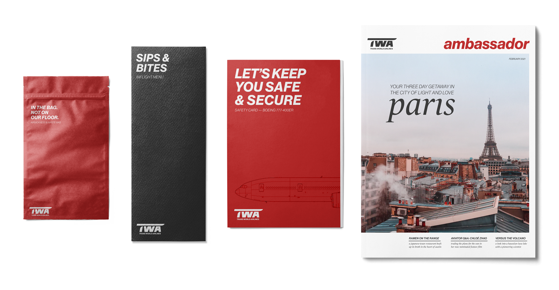
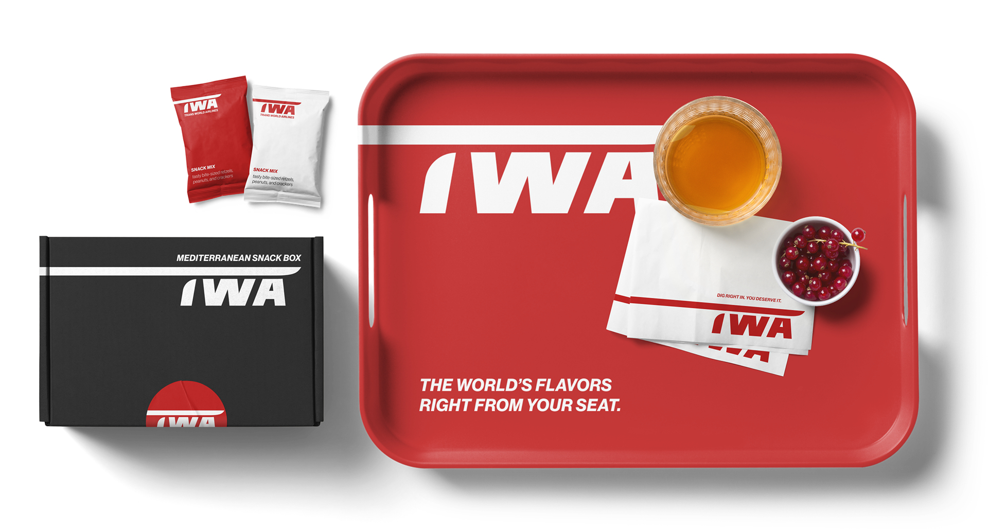
the seat backs + tray tables
CONTEXT
a revived brand identity
winter 2021 — 8 weeks
winter 2021 — 8 weeks
Client
Trans World Airlines
Steven Watson — DES368 Corporate Identity
Steven Watson — DES368 Corporate Identity
Tools
pen & paper, Illustrator, Figma, Photoshop, AfterEffects
Problem space
How might we revive and rebrand one of the world's largest airlines for a younger audience while still honoring its legacy?
Positioning Statement
For the next generation of world adventurers and young professionals, TWA modernizes its depth of industry knowledge and the glory of jet-age travel for the modern, digital era.


on the behalf of our crew...
Thank you, Steven Watson You are an amazing professor and and even more amazing individual. Your guidance and insight throughout the quarter has radically transformed and validated everything I know about creative direction and brand building. This KitKat (maybe they'll get around to naming the minis Kit and Kat one day...) and a TWA bag of airplane pretzels are for you!