A 'fledgling' display face
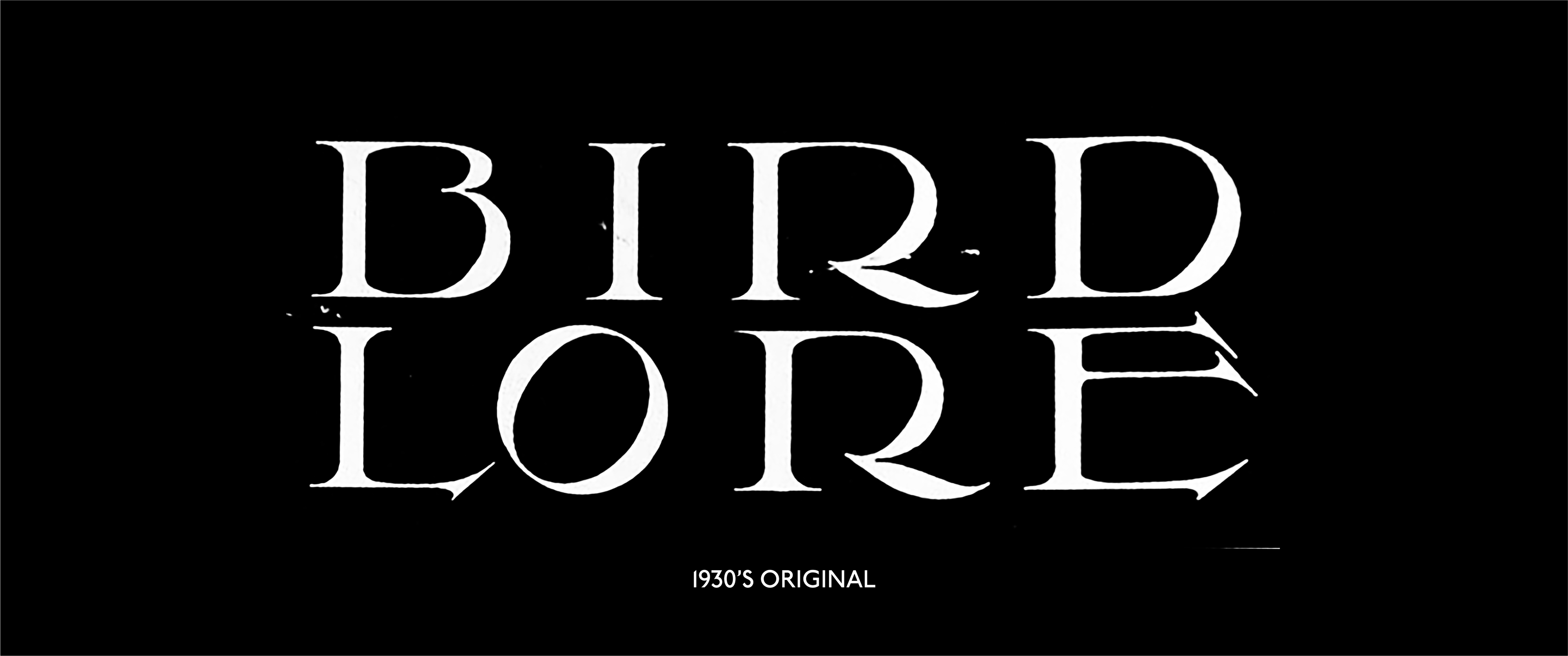
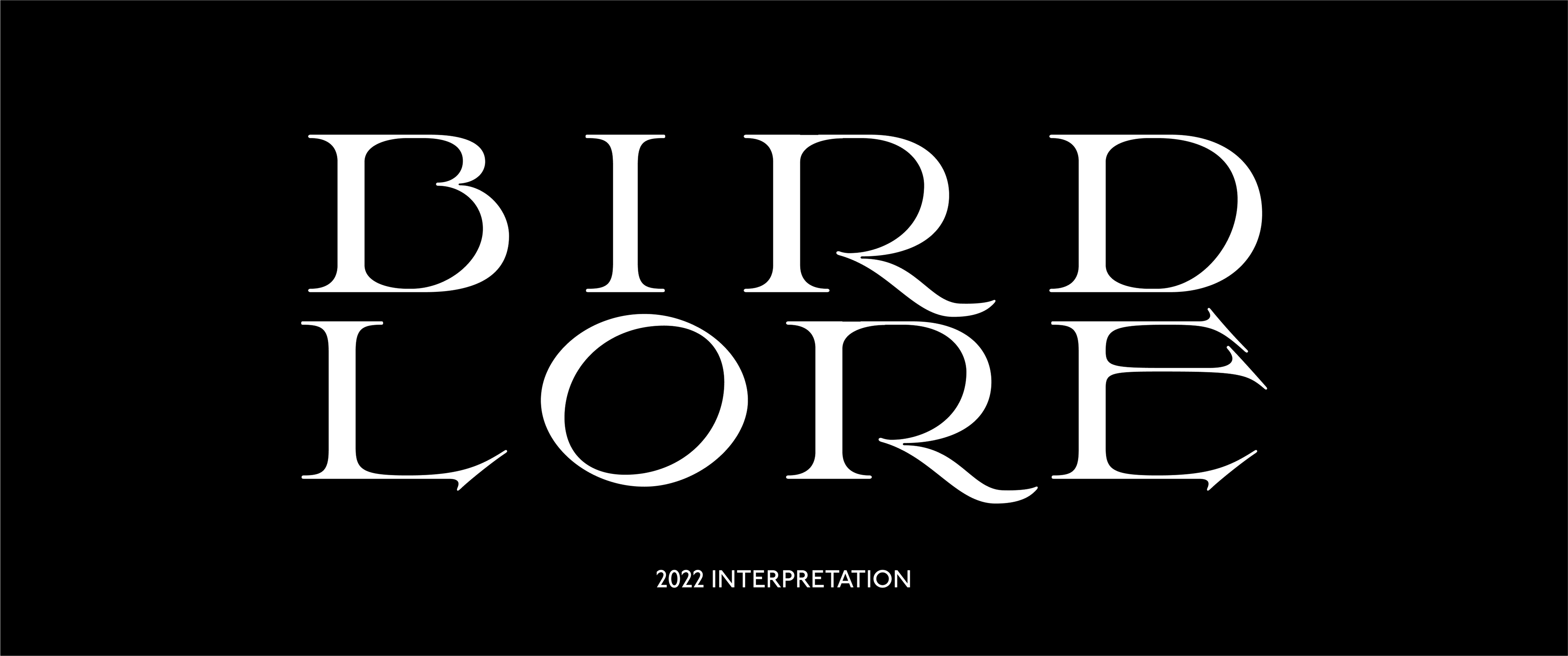
Audubon is the expansion of the early 1900's magazine Bird Lore — now Audubon. The magazine and prior publications focused on natures and the study / conservation of birds. This interpretation, in collaboration with Burke Smithers is an attempt to take a traditional logotype and expand it into a more modern display serif. In a way it parallels the work of those at Bird Lore when they modernised into today's Audubon.
This project is on-going, but we couldn't resist sharing it due to it's uncanny visual success in it's early drafts.
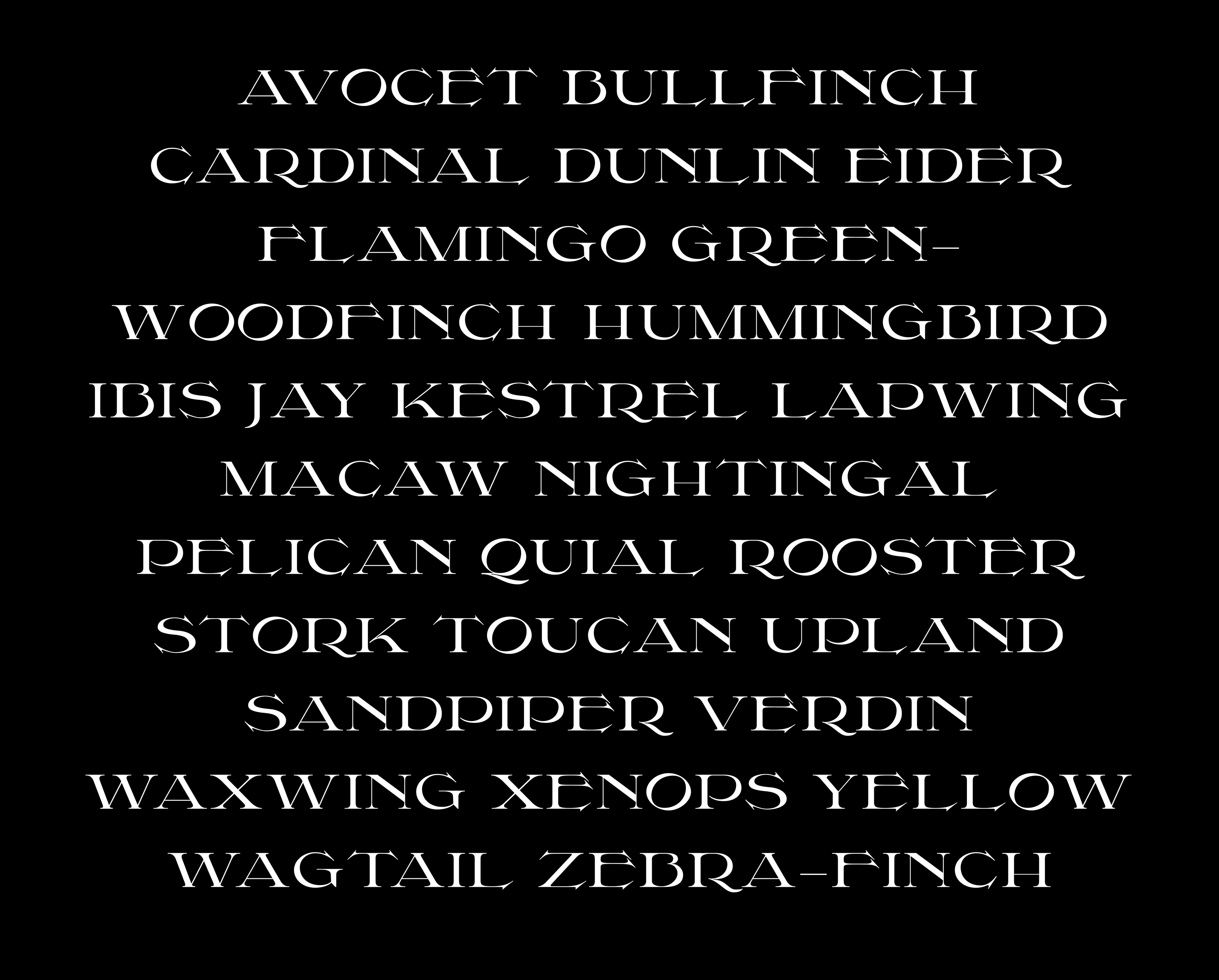
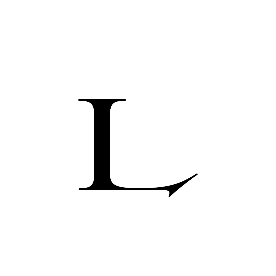
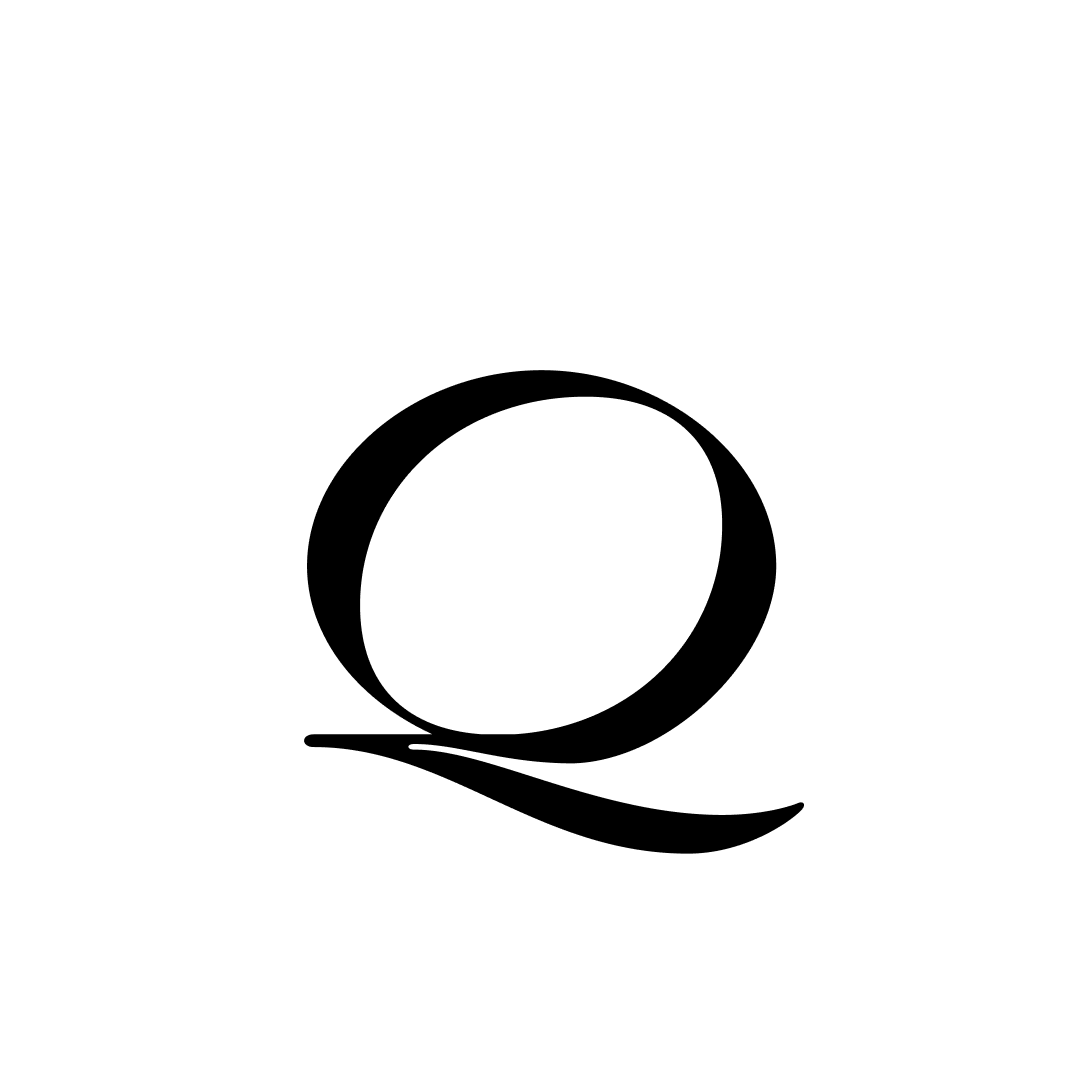
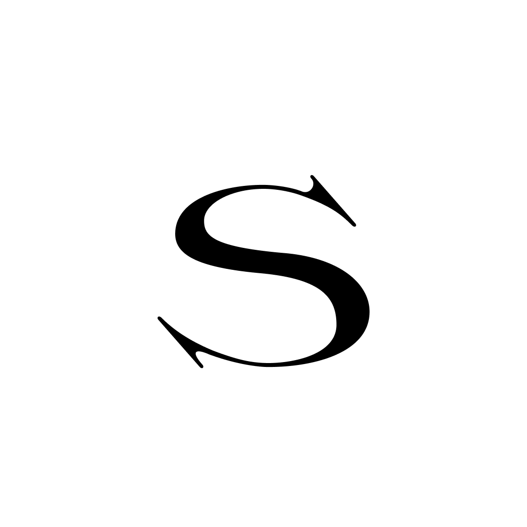
Current Glyph Set


ABOUT LAWSON
Style
a single weight display serif
TEAM
Burke Smithers — @burkinks
DESIGN GOAL
to expand out knowledge of display typefaces by using the skeleton set up by a early 1900's logotype.