A humble and 'really nice' meal...
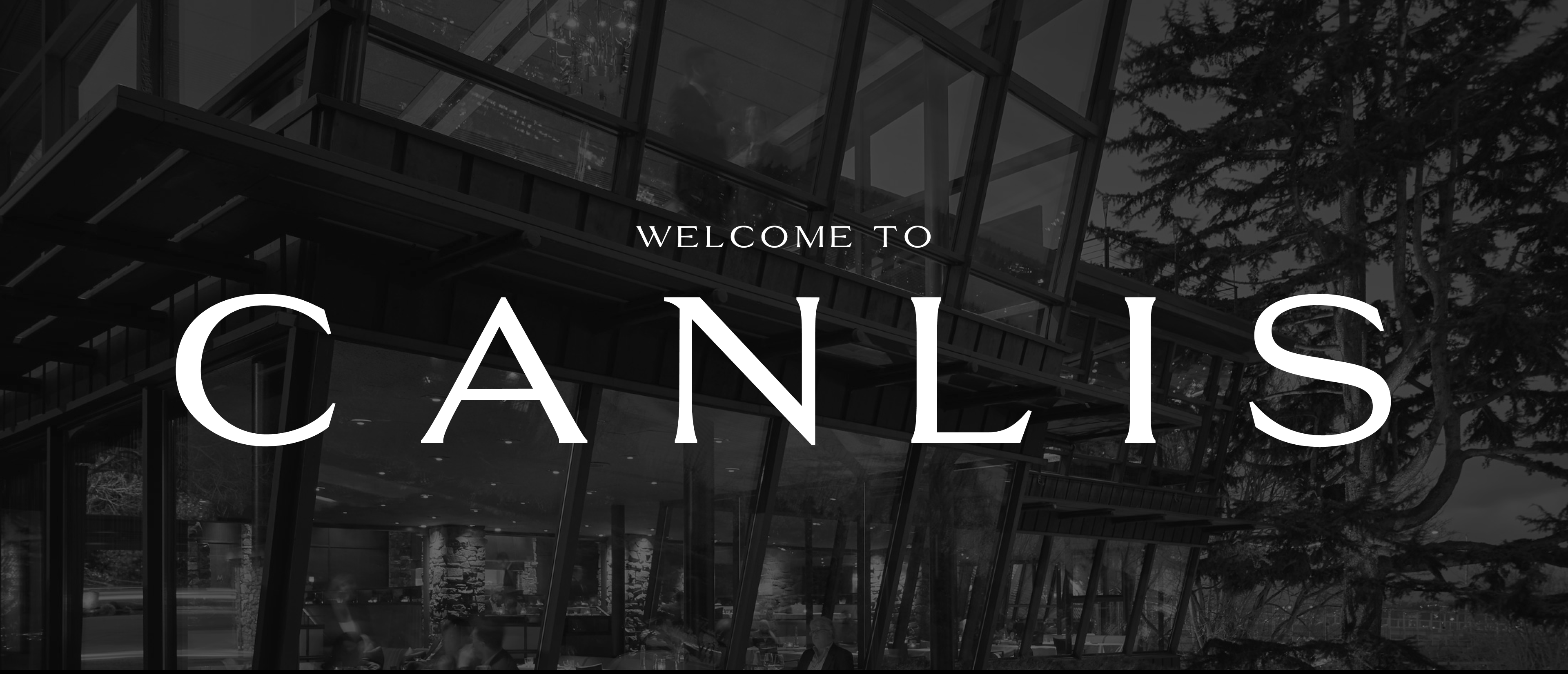
Canlis is an institution in Seattle's fine-dining landscape. The restaurant has a rich history that follows an immigrants appreciation for the melting pot of America and the generations that follow him. The setting is in a architecturally rich mid-century home whose view stretches from Lake Union to the Cascade Range in the distance.
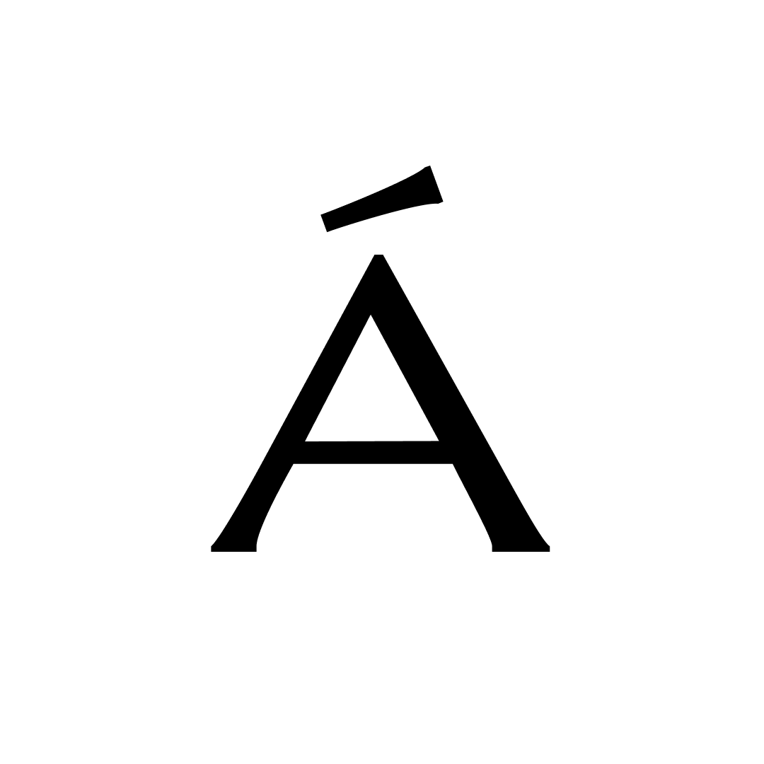
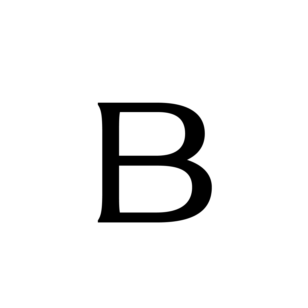
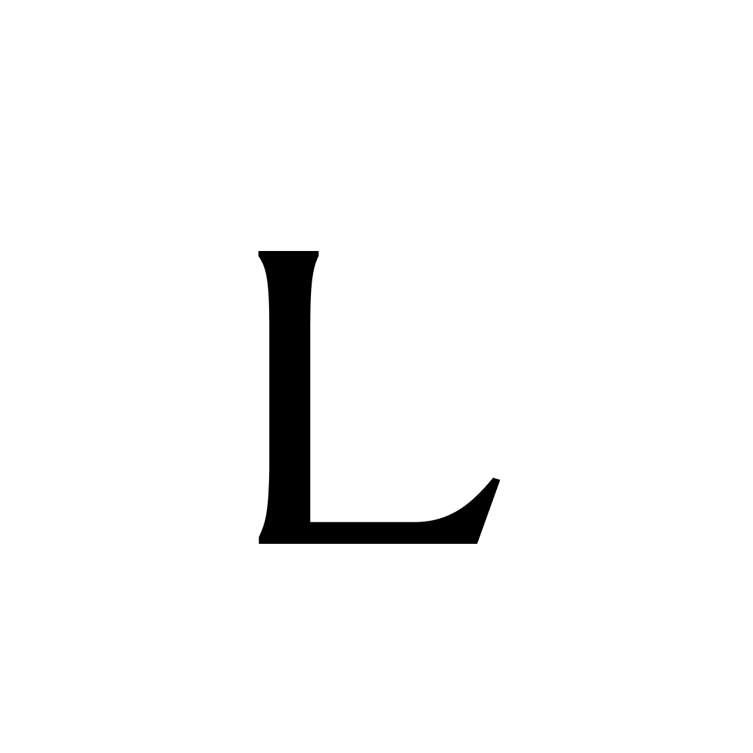
The typeface is based off of Canlis' refreshed logotype. It's thesis is based in humble humanist forms layered on the structure of minimal mid-century architecture.

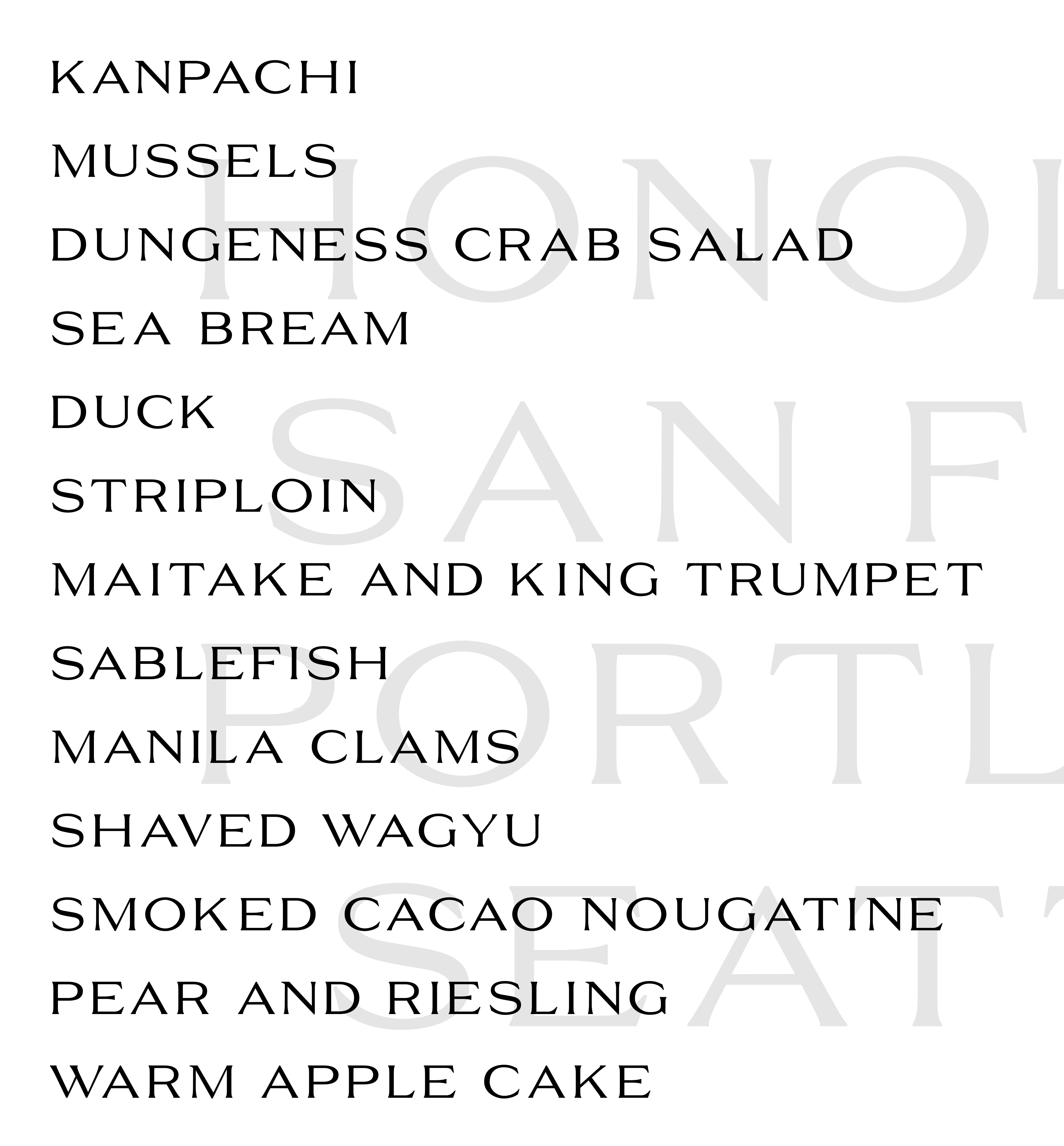
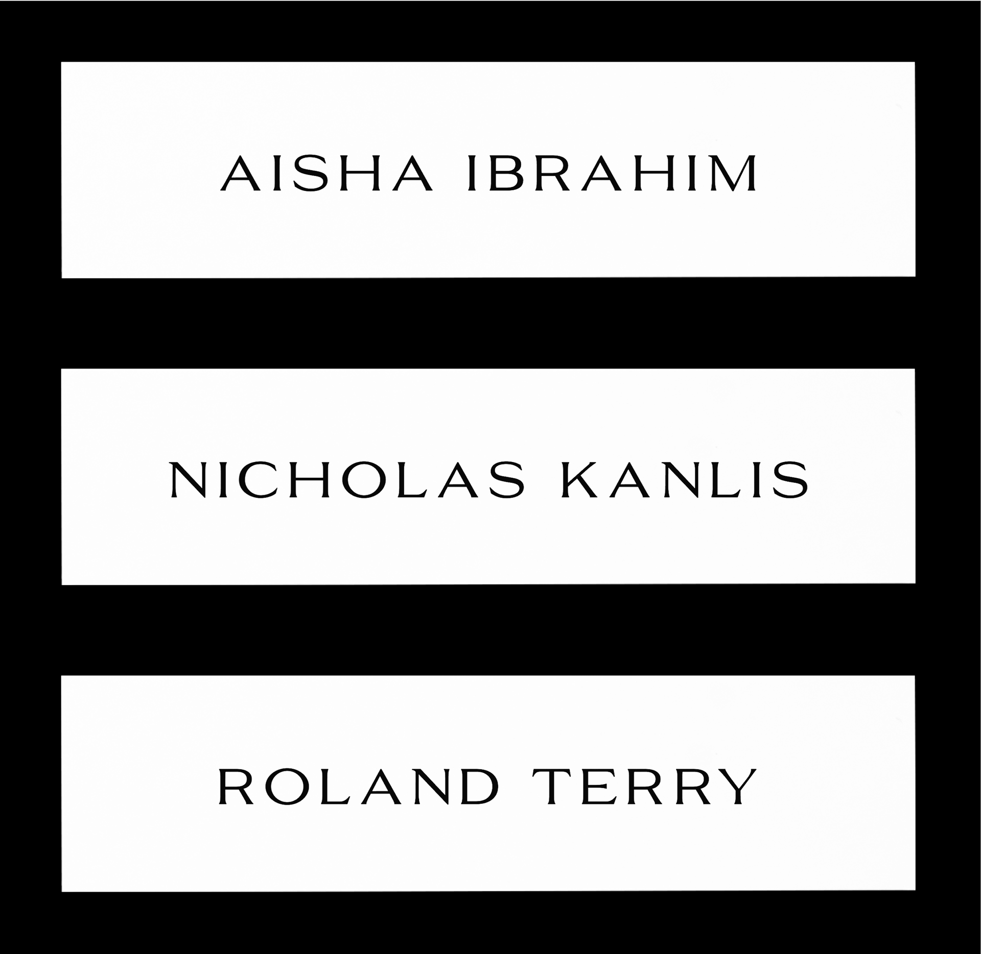
GLYPH SET


ABOUT CANLIS
CONTEXT
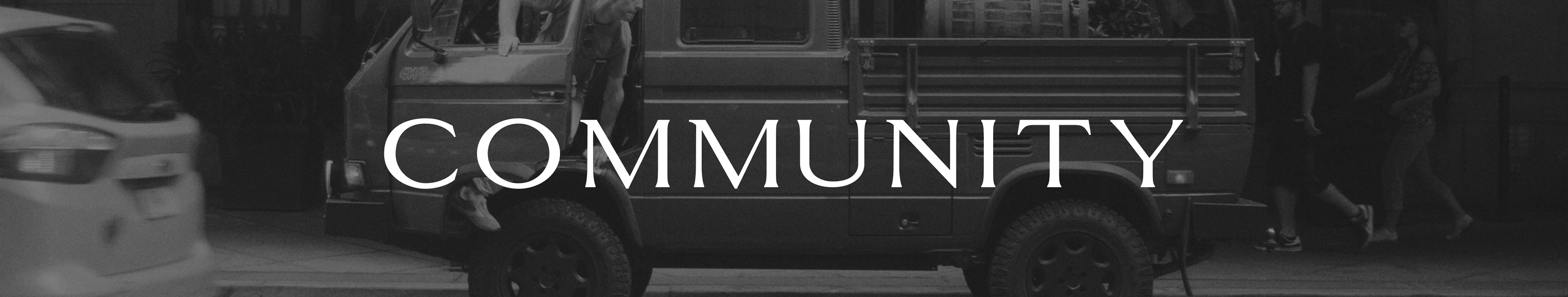
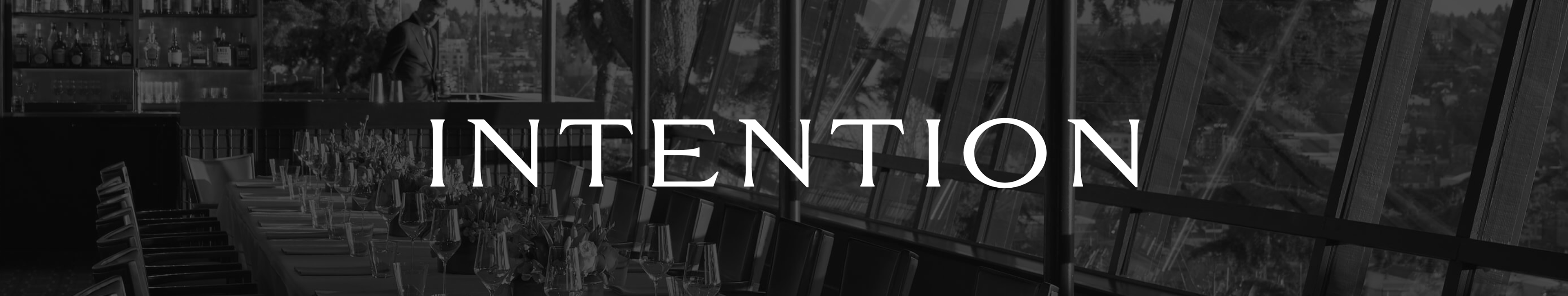
uppercase display typeface
CLIENT
Canlis Restaurant — Seattle, WA
DESIGN GOAL
take Canlis' logotype and expanded into a limited glyphs set they can use for headers on print materials.